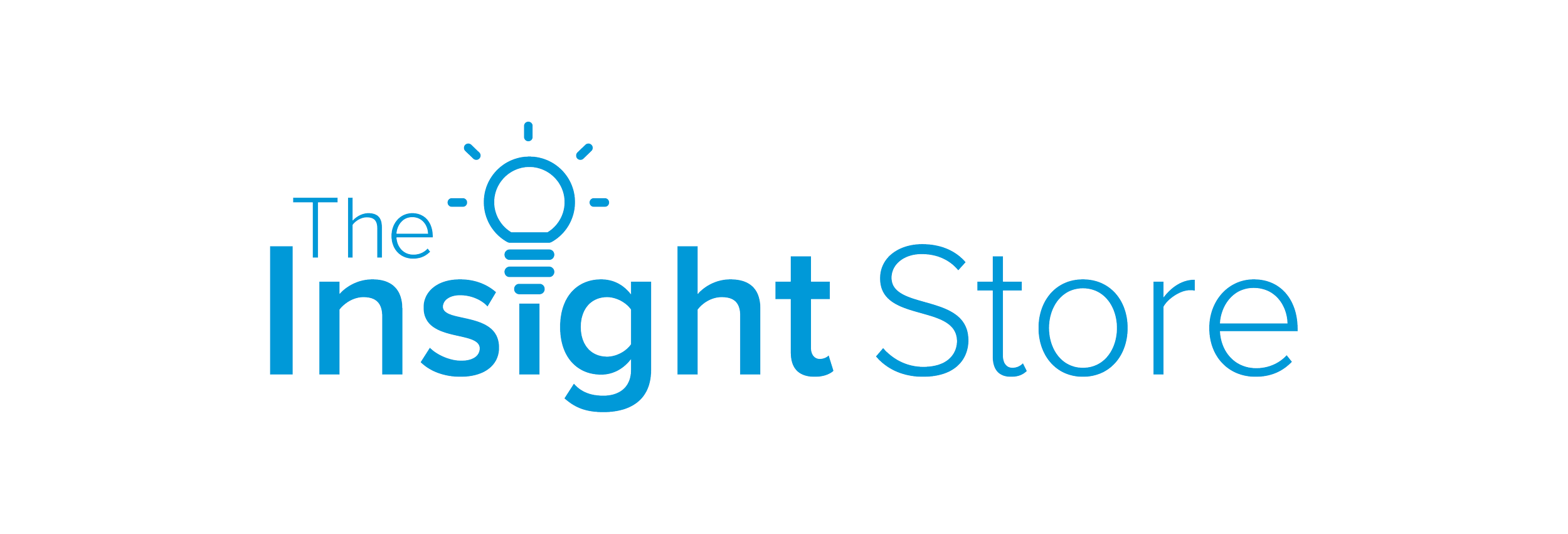
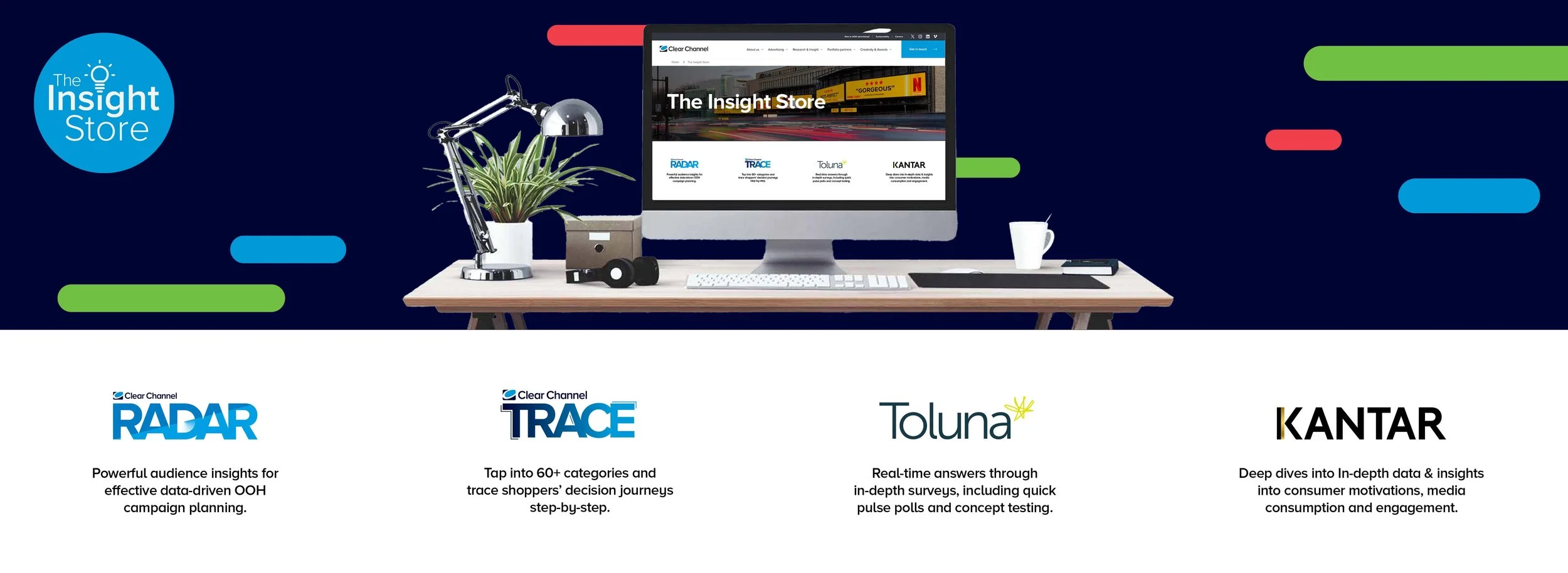
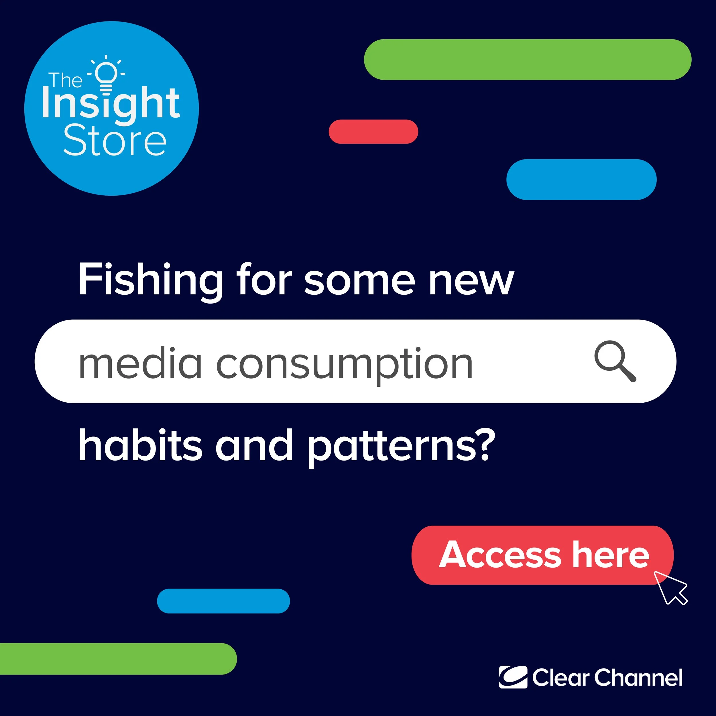
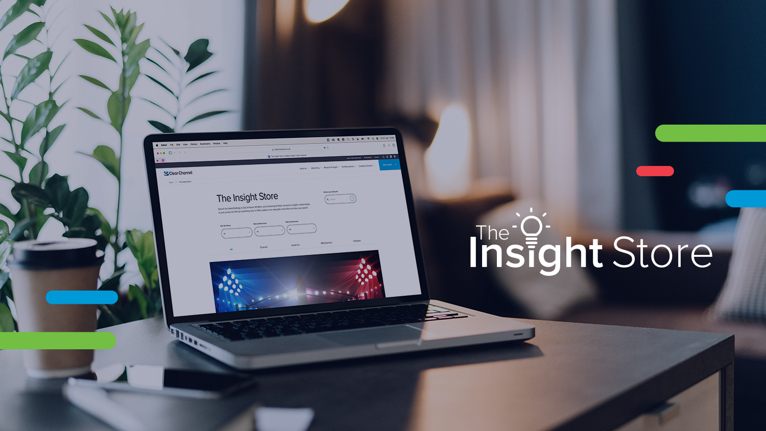
The Insight Store.
Developed branding for Clear Channel Insight Store, ensuring a standout, innovative, and user-friendly identity. Created a visual language aligning with the mission to make data exploration accessible and exciting, defining color palette, typography, and logo design for dynamism and modernity. Designed marketing assets to captivate the target audience, maintaining consistency across channels. The goal was to inspire confidence in users for data-driven decisions.


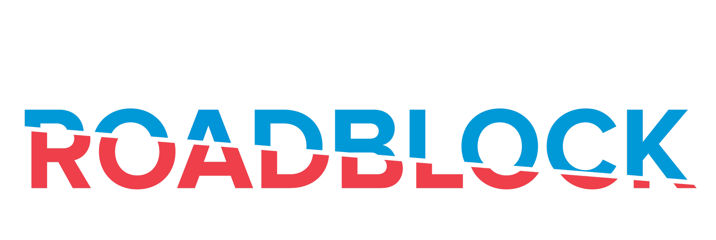
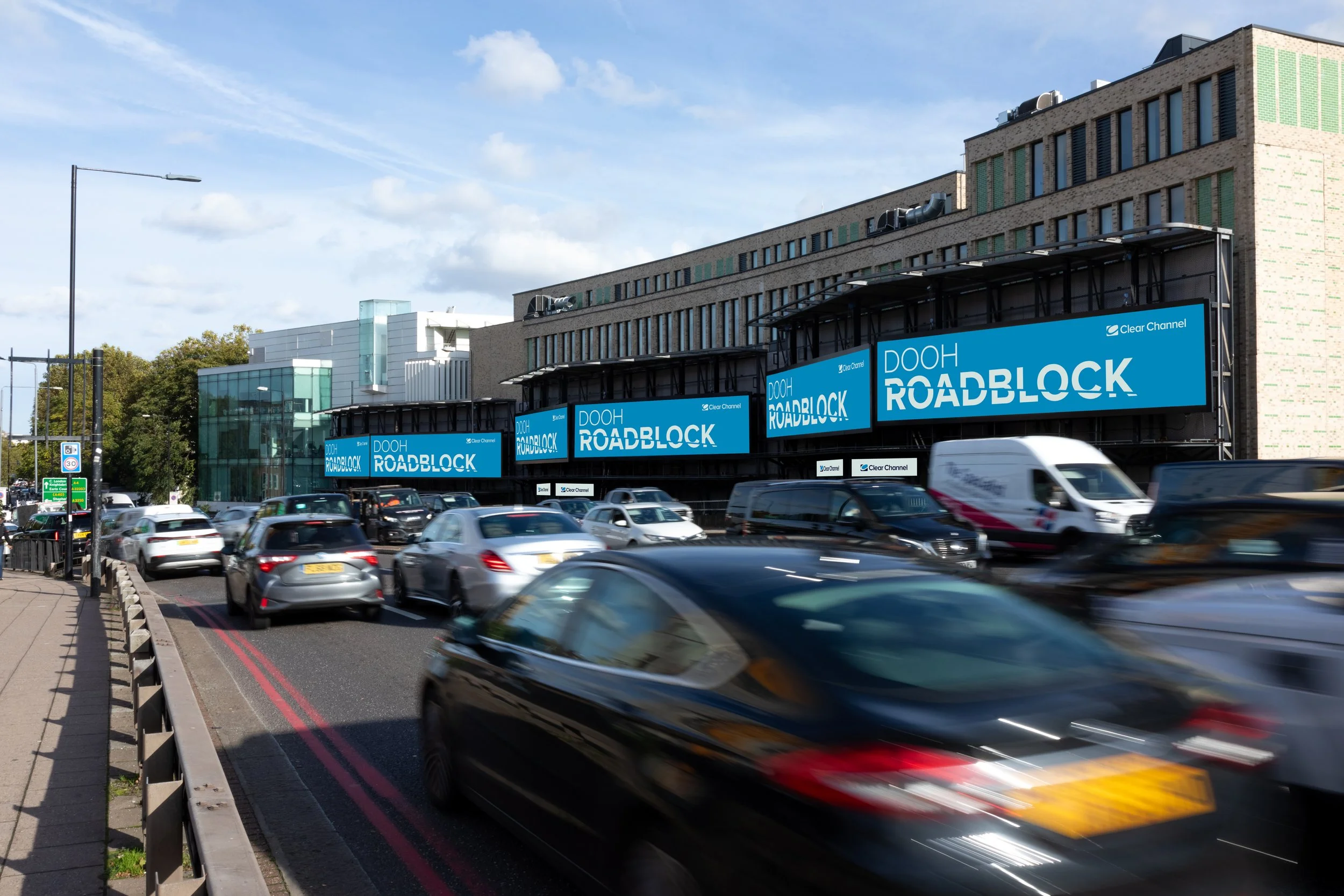
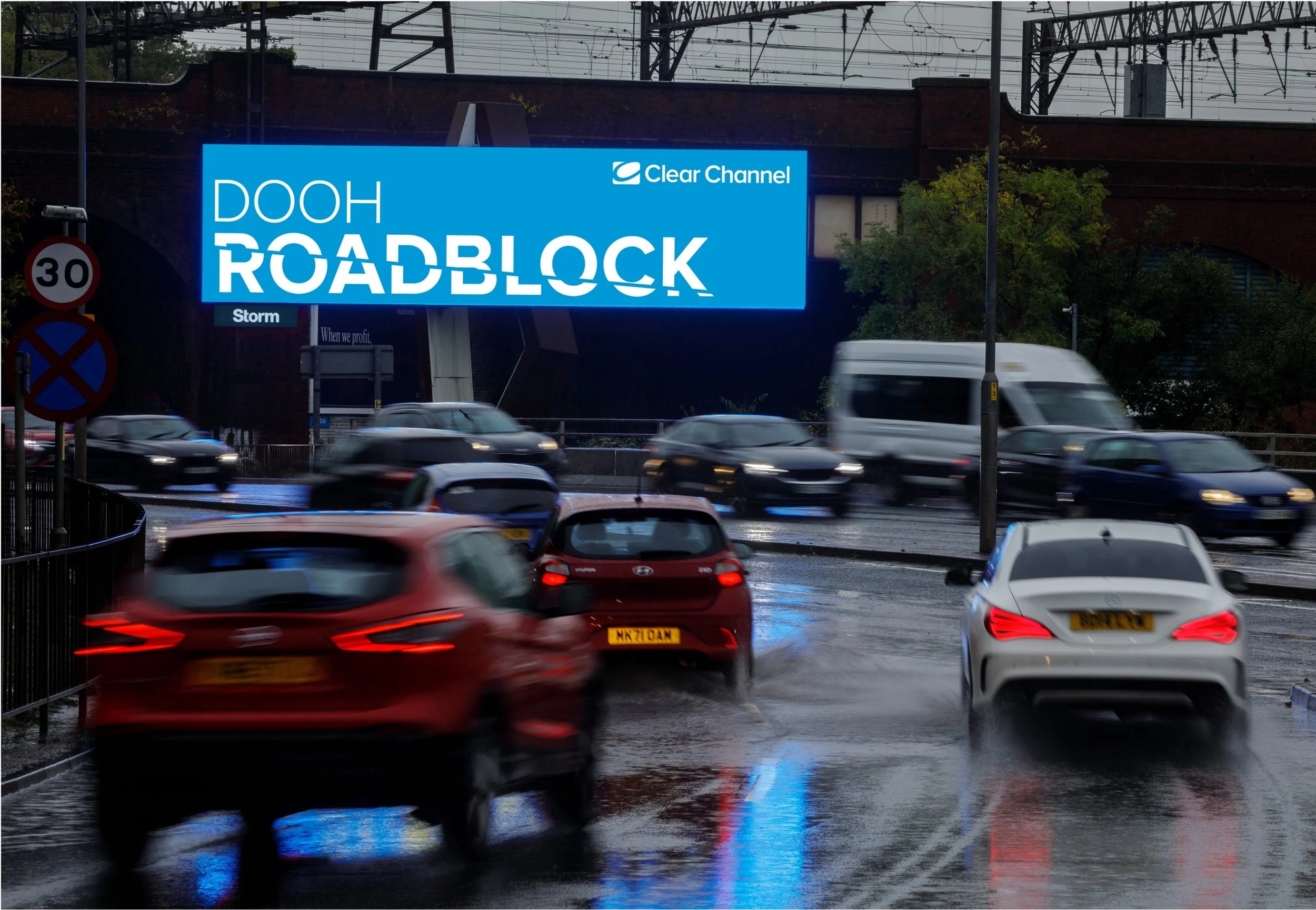
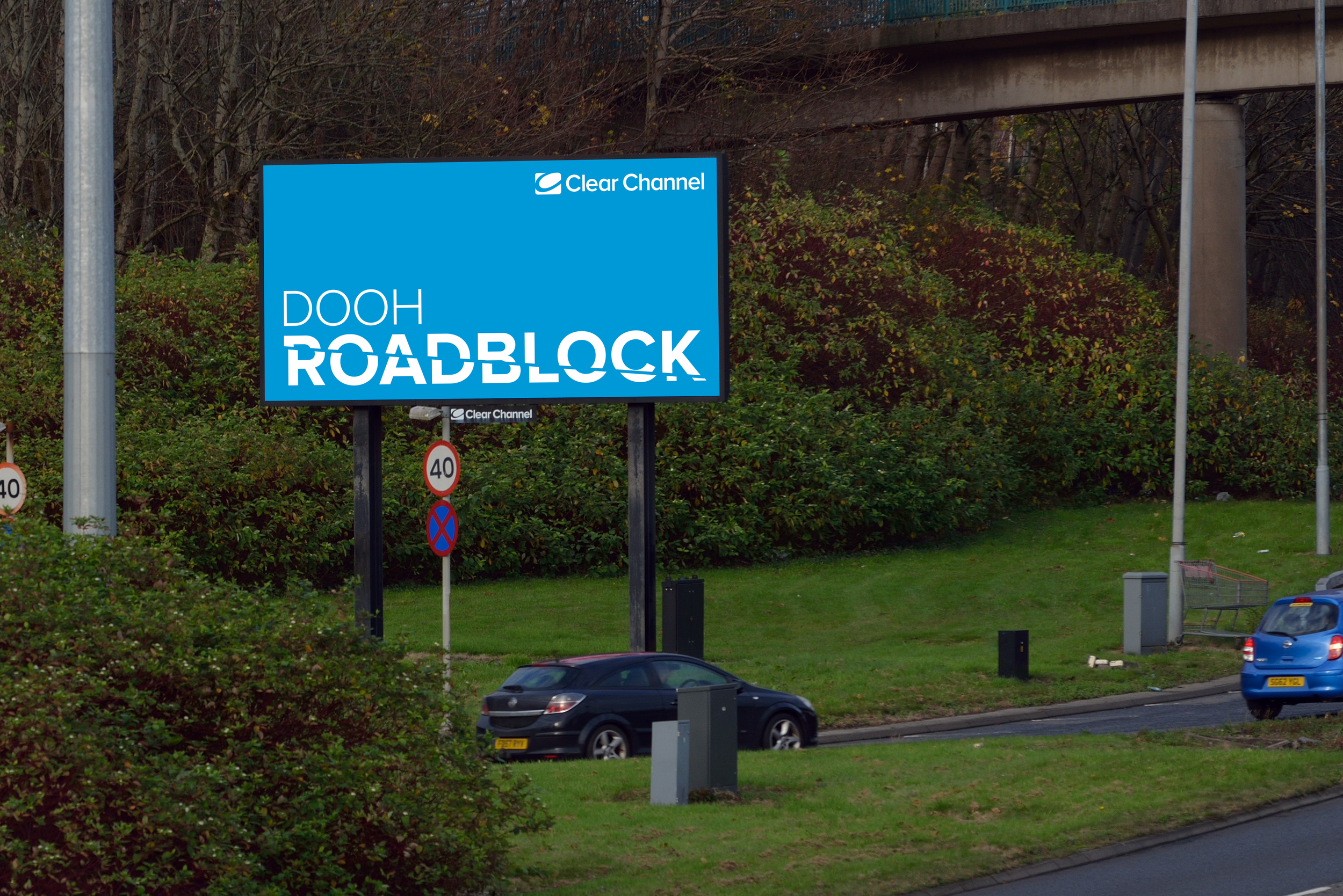
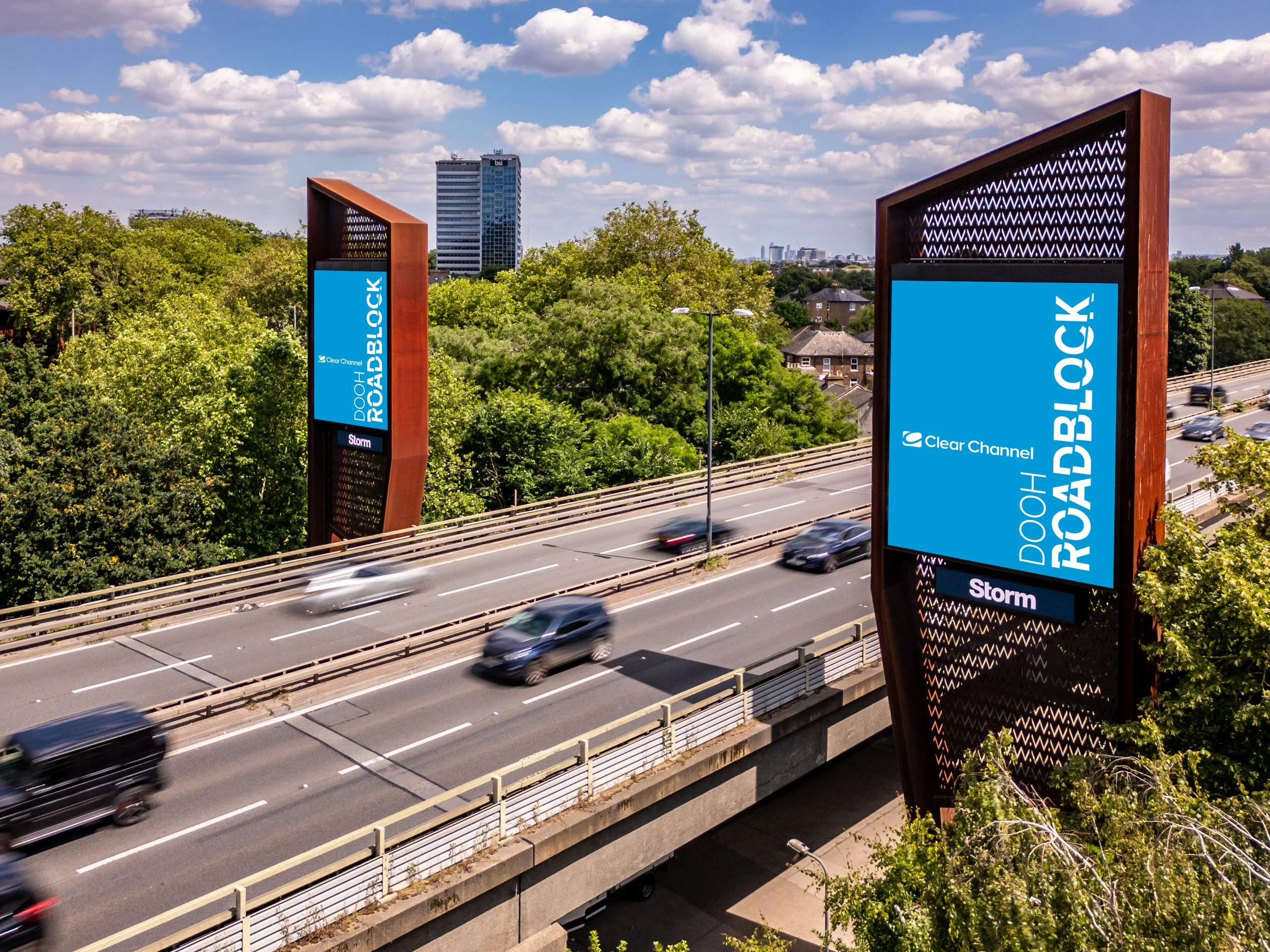
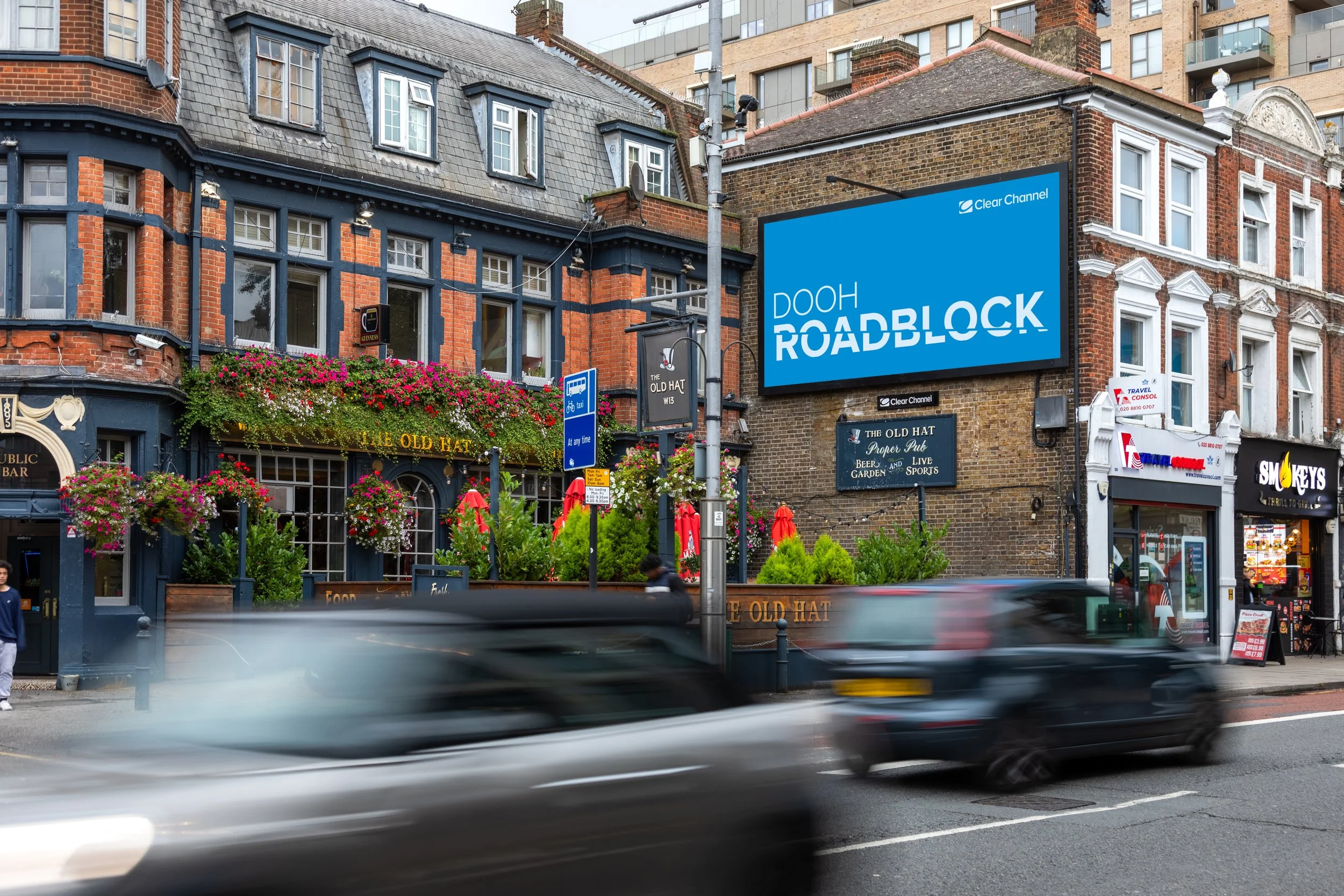
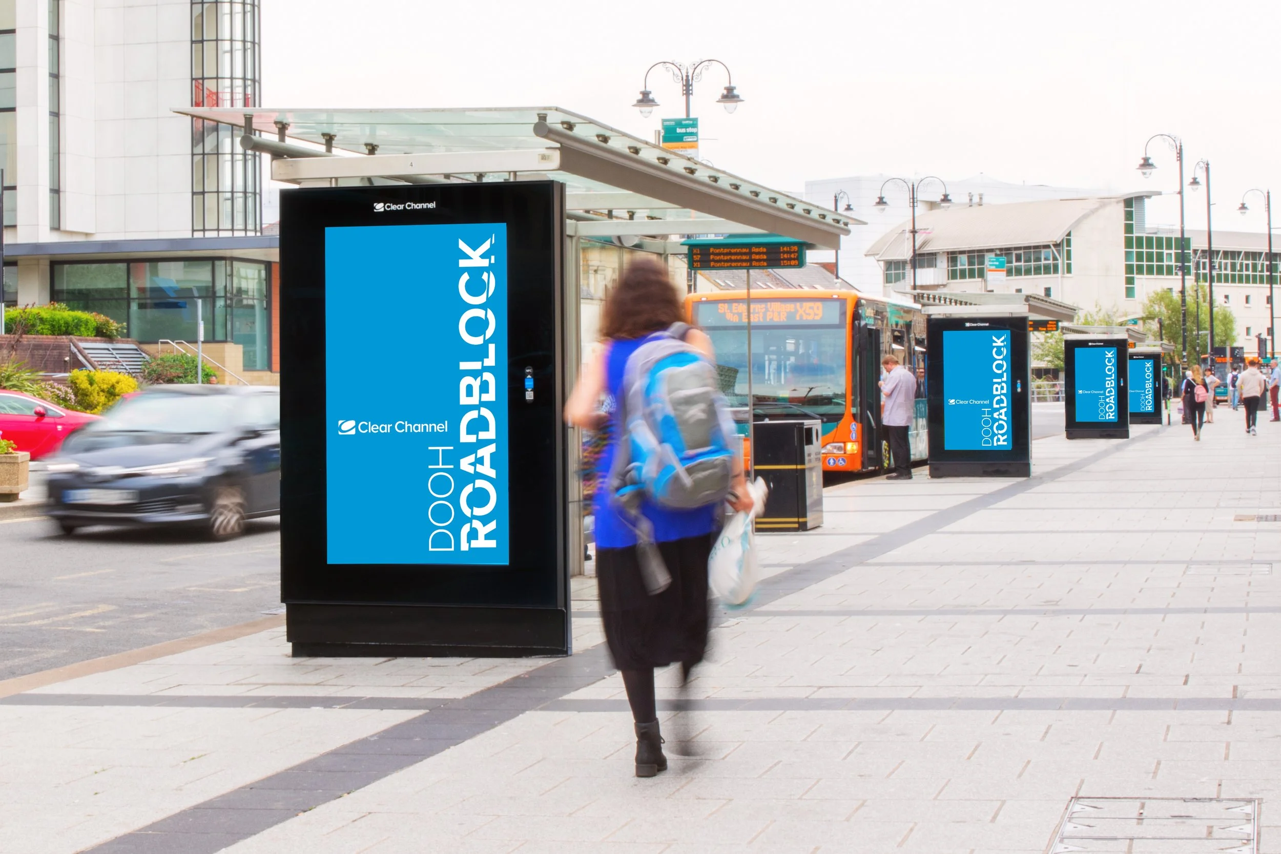
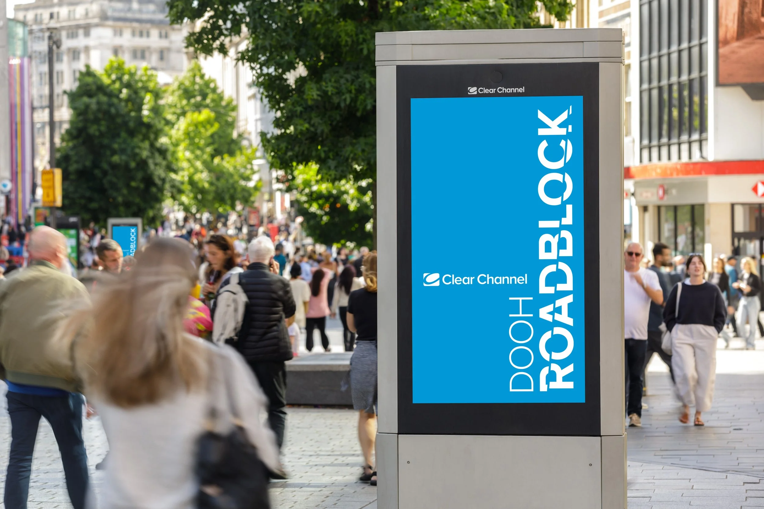
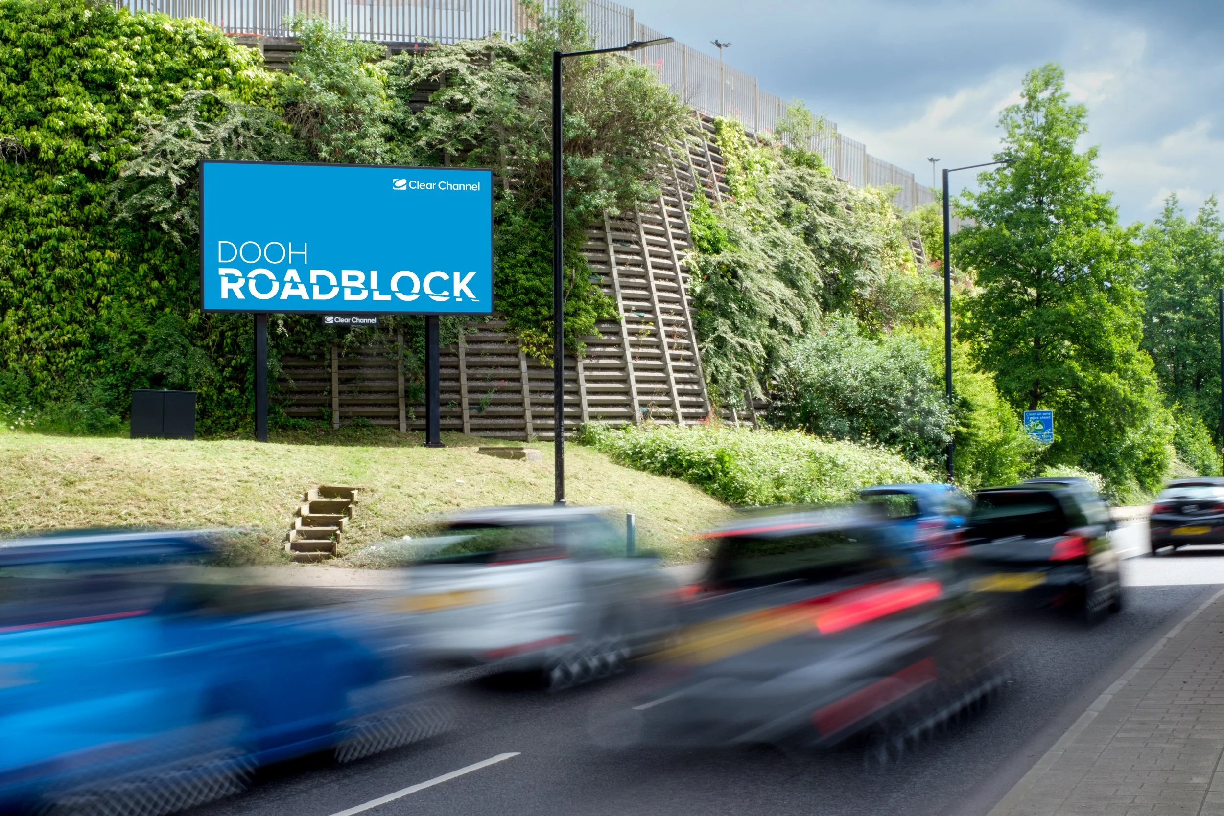
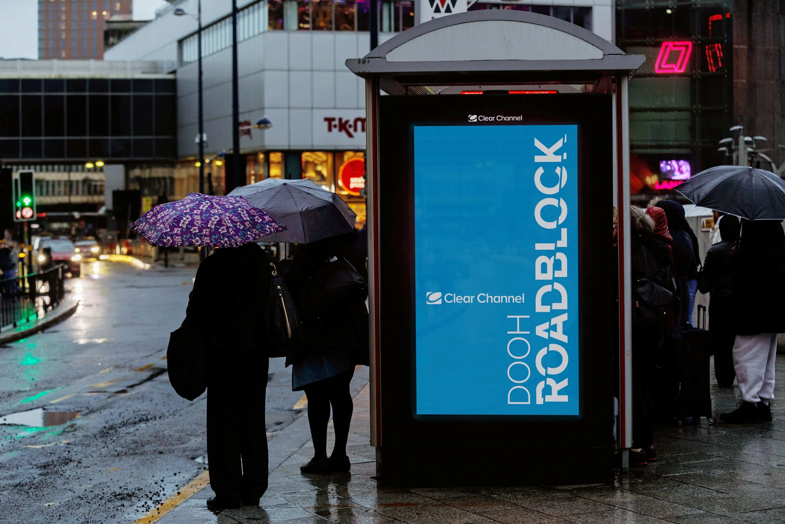
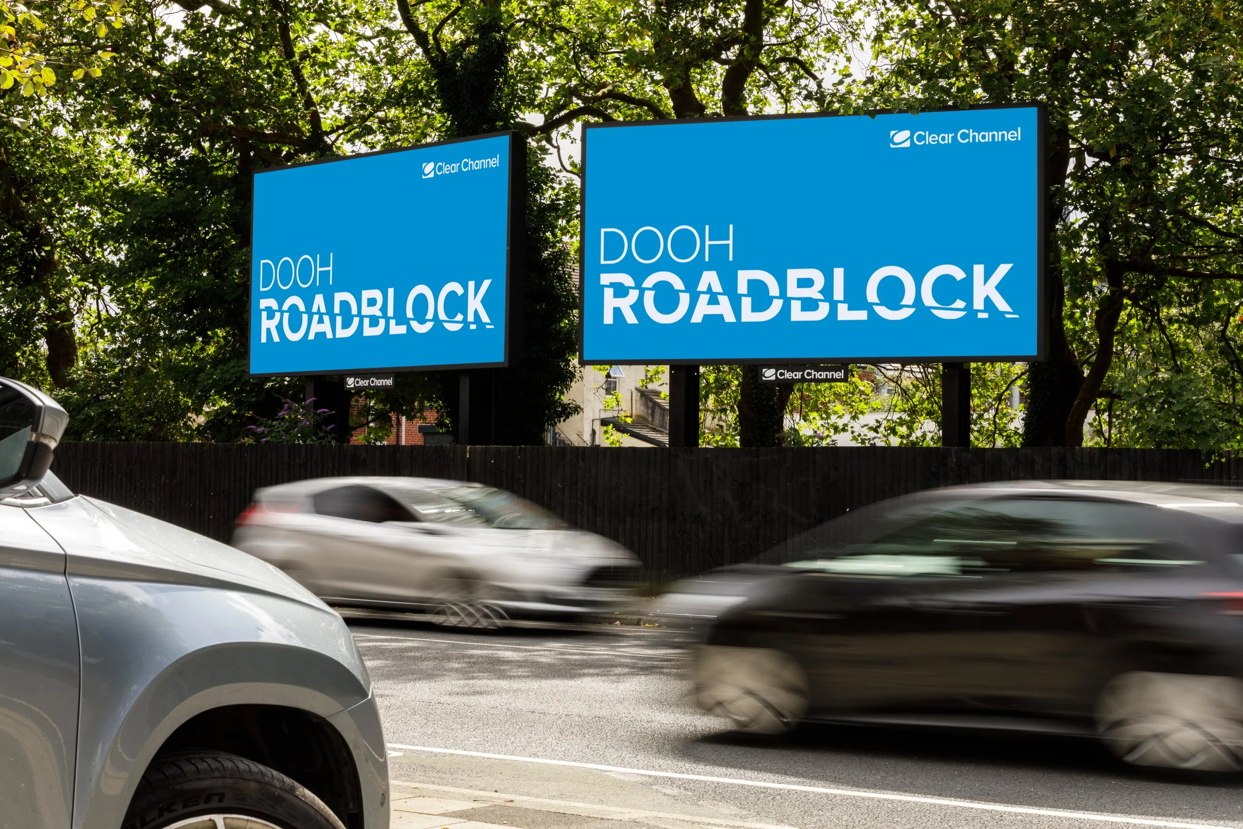
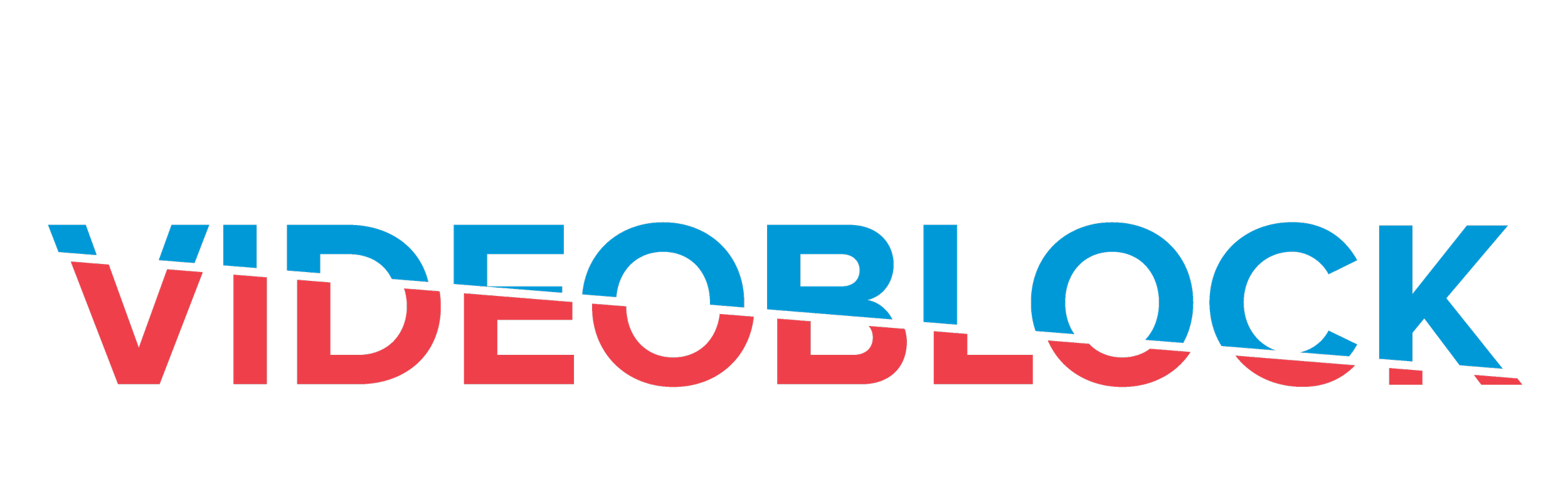
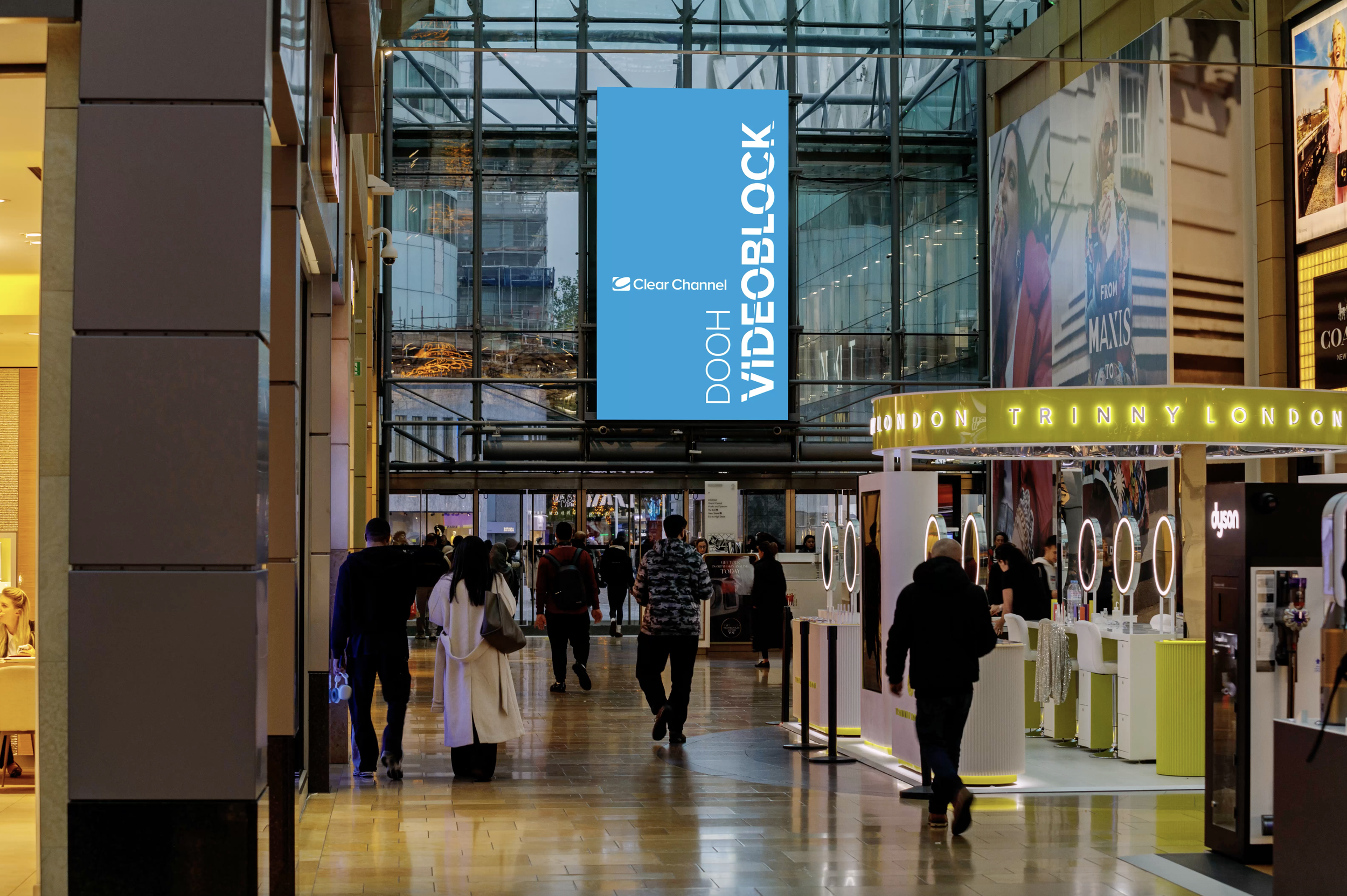
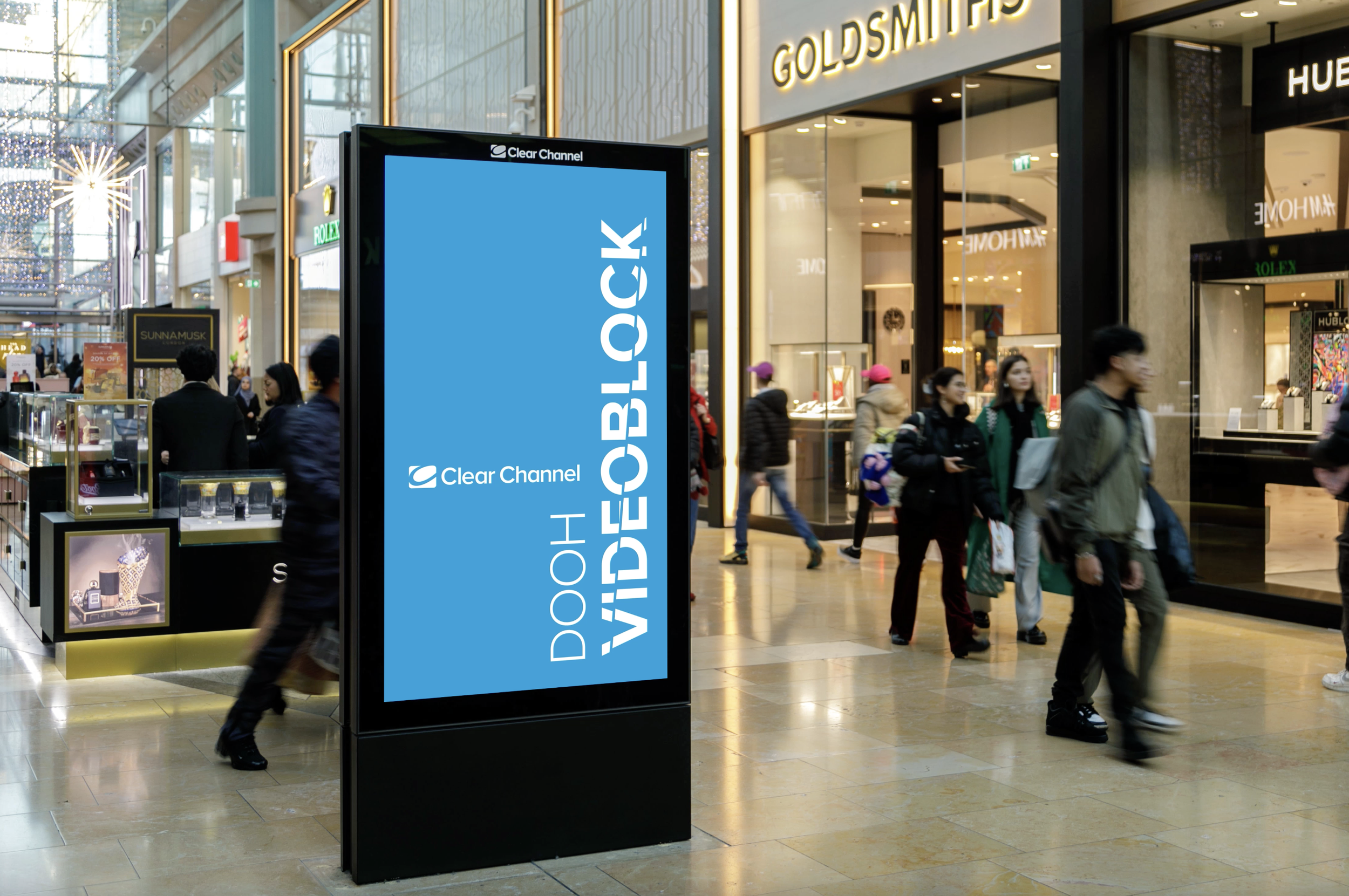
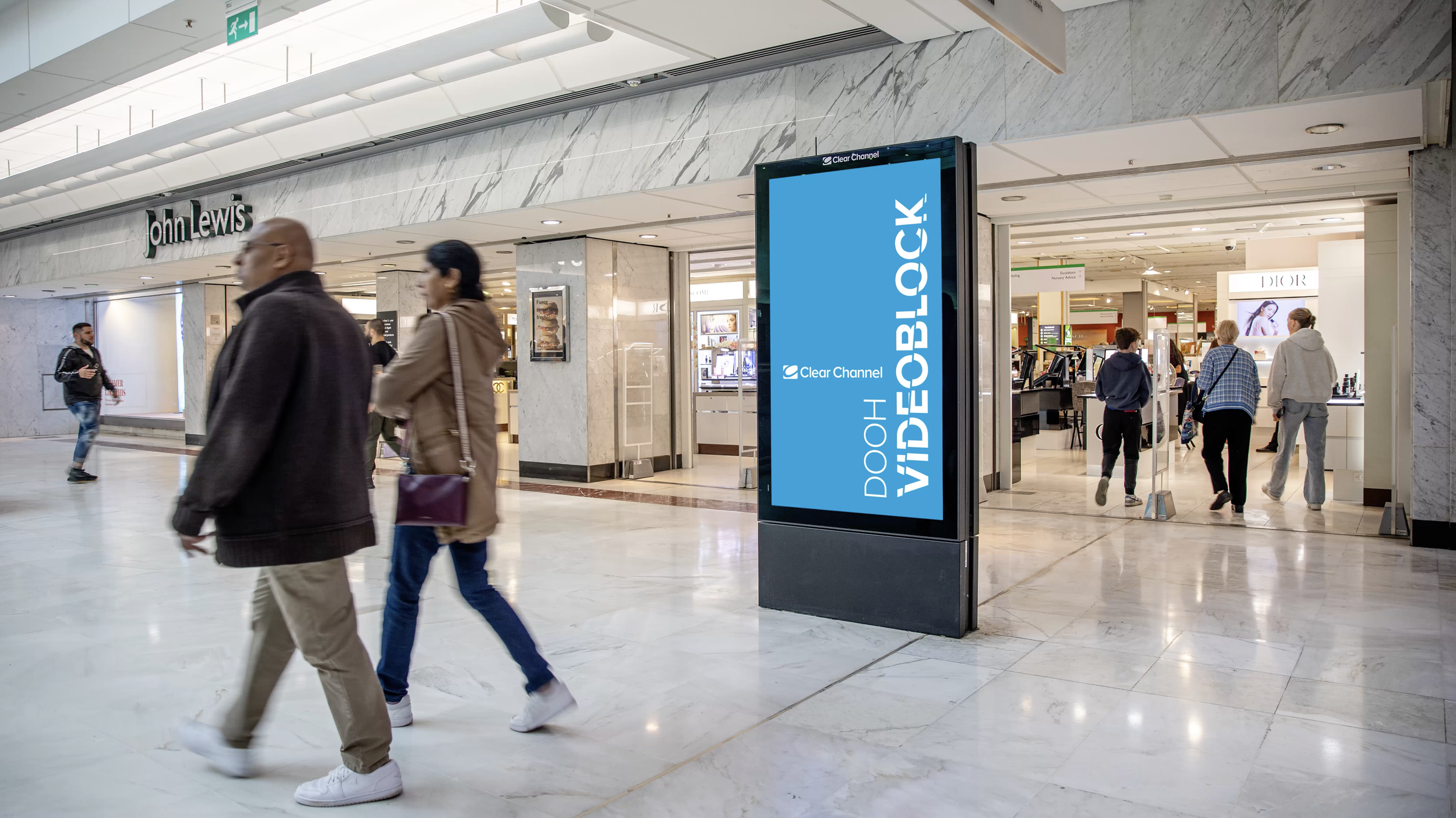
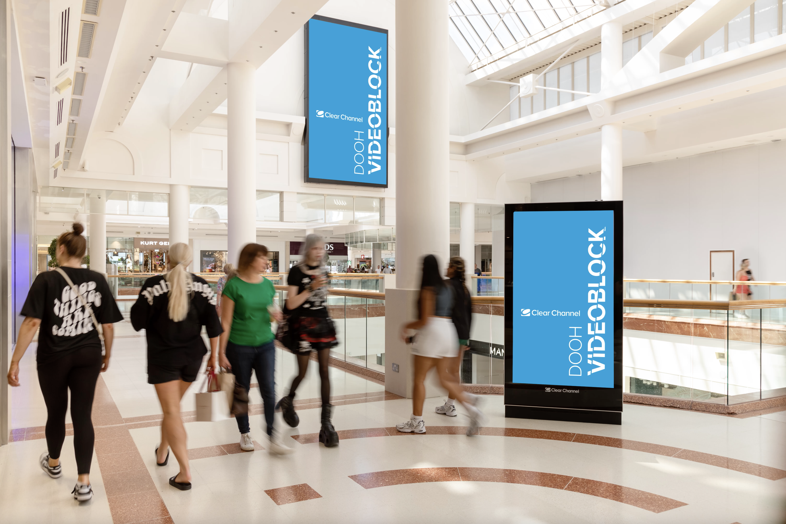
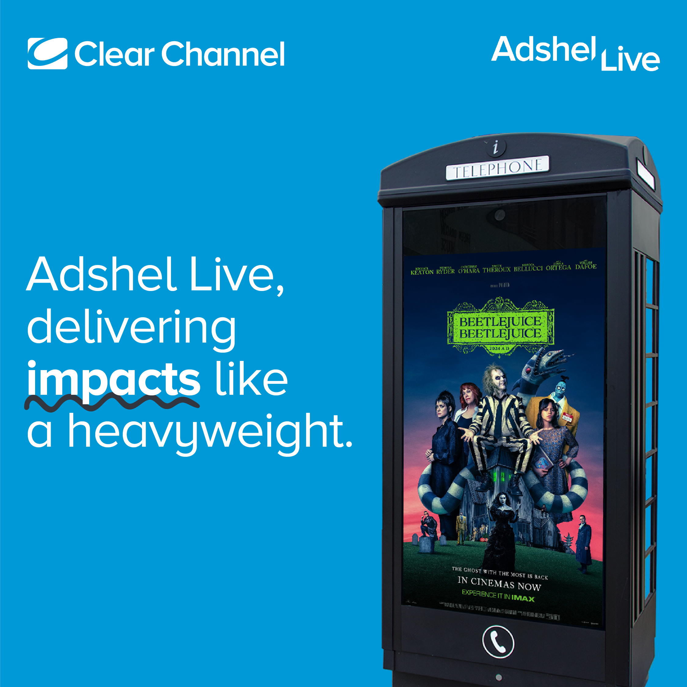
DOOH ROADBLOCK & VIDEOBLOCK.
I partnered with Sales to launch two bold new DOOH products: DOOH ROADBLOCK and VIDEOBLOCK. I developed all supporting assets to power their sales push—crafting high-impact messaging and creating visual mocks to help bring the concepts to life. I also built interactive experiences in Ceros to showcase the scale and impact of each product in a dynamic, engaging way. The result? A compelling, visually-led sales toolkit designed to grab attention, spark conversations, and drive conversions.

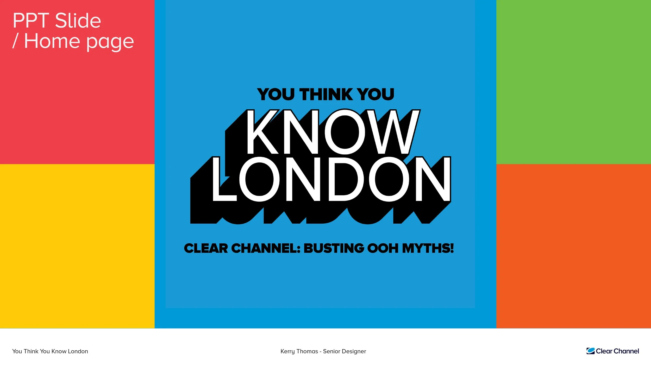
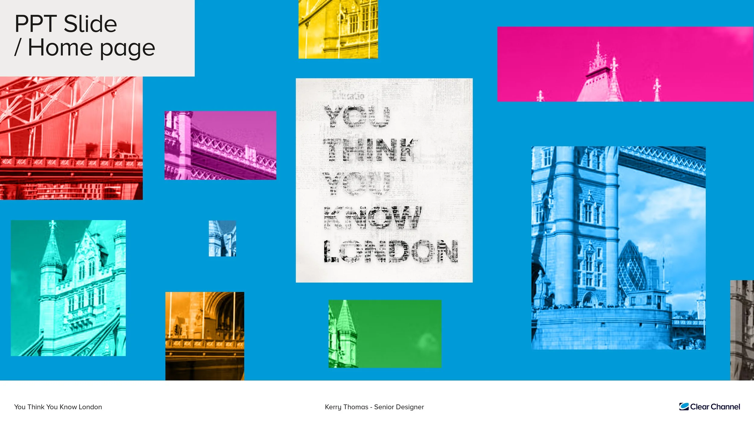
You think you know London!
For the TfL pitch, Clear Channel proposes a captivating hero campaign titled
“You think you know London!” aimed at reframing the TfL estate and transforming perceptions for agencies, strategists, and media planners. This campaign showcases the brilliance of the TfL estate, highlights London's iconic nature, and emphasizes the unique characteristics of its diverse audience.
Below are the two ideas pitched to the Head of Marketing and the design and marketing team.
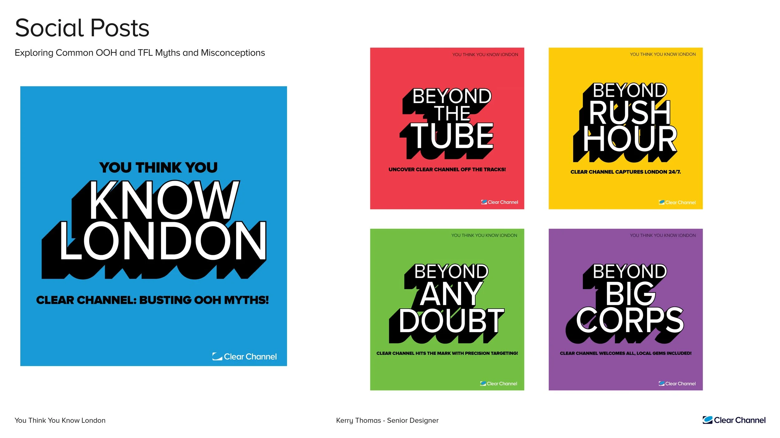
Beyond.
This concept revolves around pushing the boundaries of common misconceptions, making a meaningful impact, and showcasing Clear Channel’s commitment to innovative thinking that transcends conventional limits.
By presenting a series of bold statements or myths alongside Clear Channel’s name and solutions, and incorporating our brand colors for social media, we aim to keep our brand at the forefront of discussions.
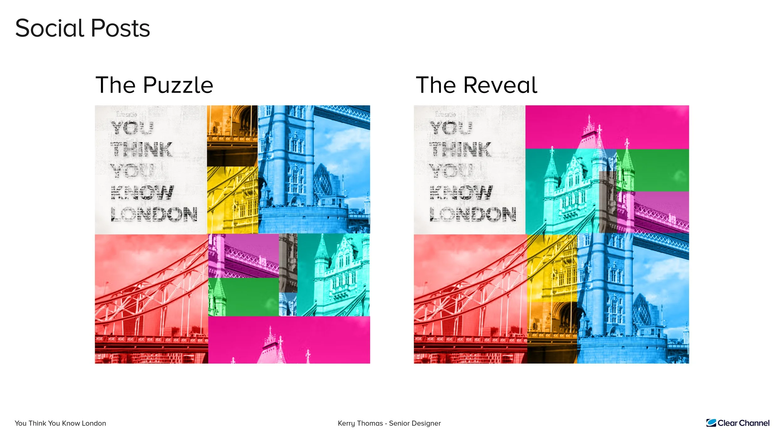
Guessmark.
The concept here is to craft a captivating puzzle using both famous and slightly lesser-known landmarks, perfect for sharing on social media platforms to actively involve the audience in guessing the featured landmark. Later, the reveal adds an element of satisfaction.
This strategy aims to foster public engagement.
At Clear Channel UK, I enjoyed working on exciting events and initiatives. I created eye-catching marketing materials that let my creativity shine in an innovative environment. My time there was a thrilling ride, from brainstorming fun campaigns to designing graphics that stood out.
Each project was a chance to experiment and push design boundaries. My experience at Clear Channel UK was a key part of my career, enhancing my skills and fueling my passion for design in this fast-paced field.
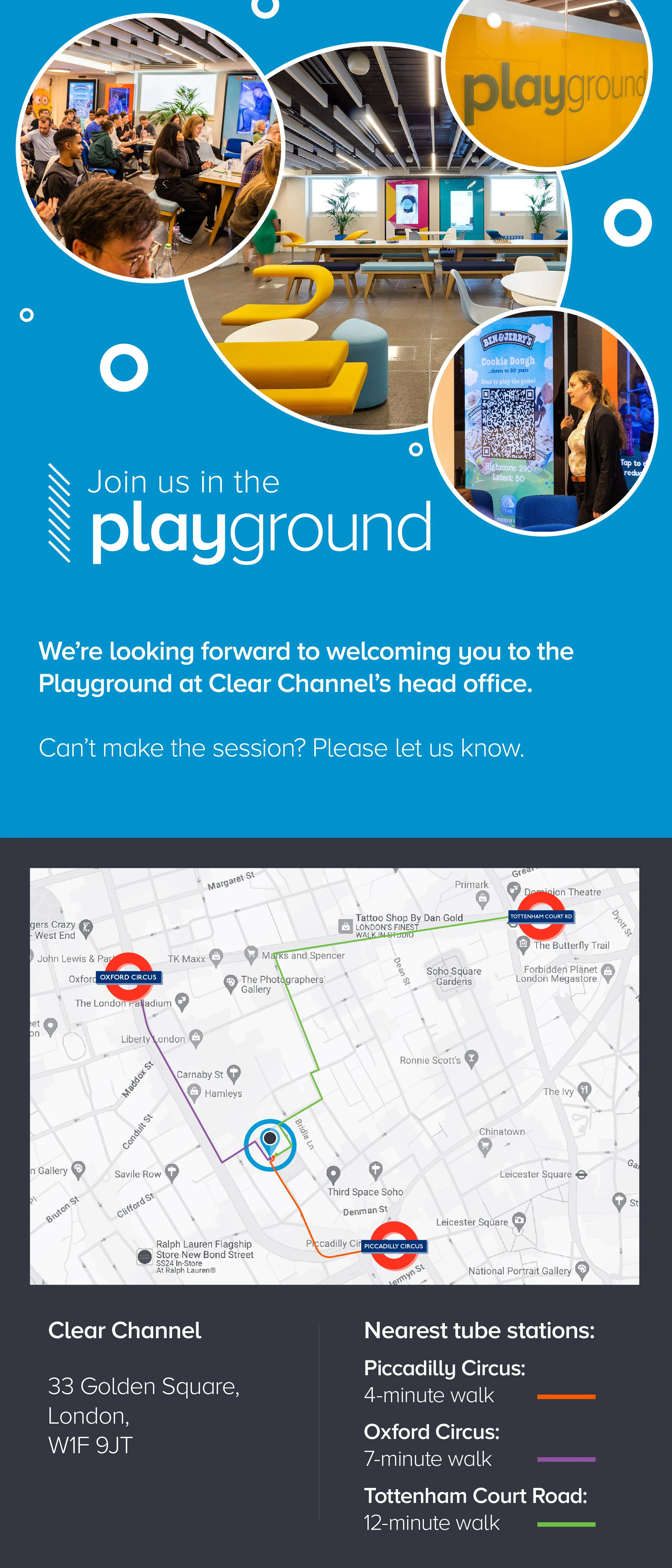
Events.
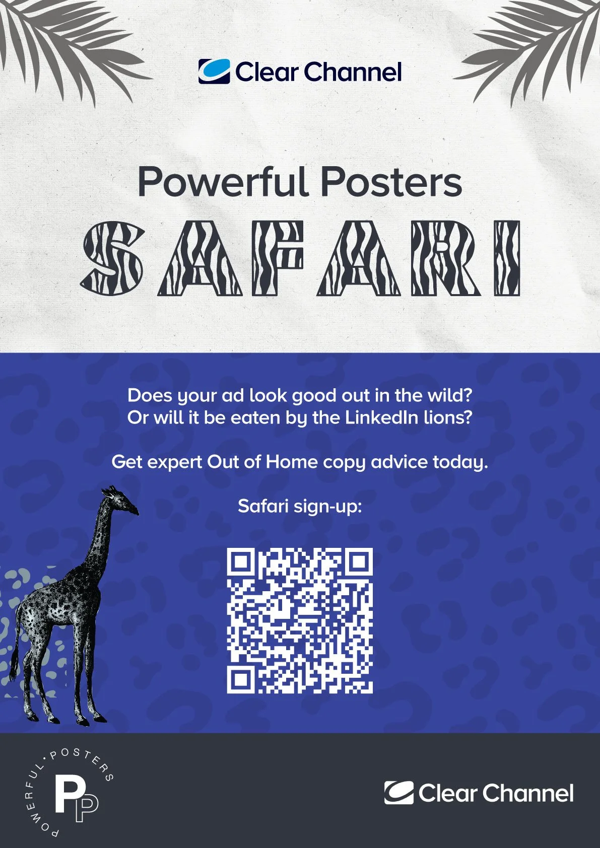
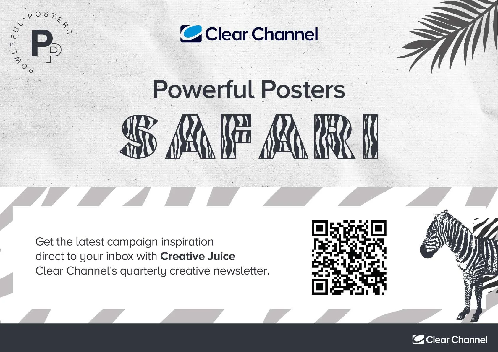
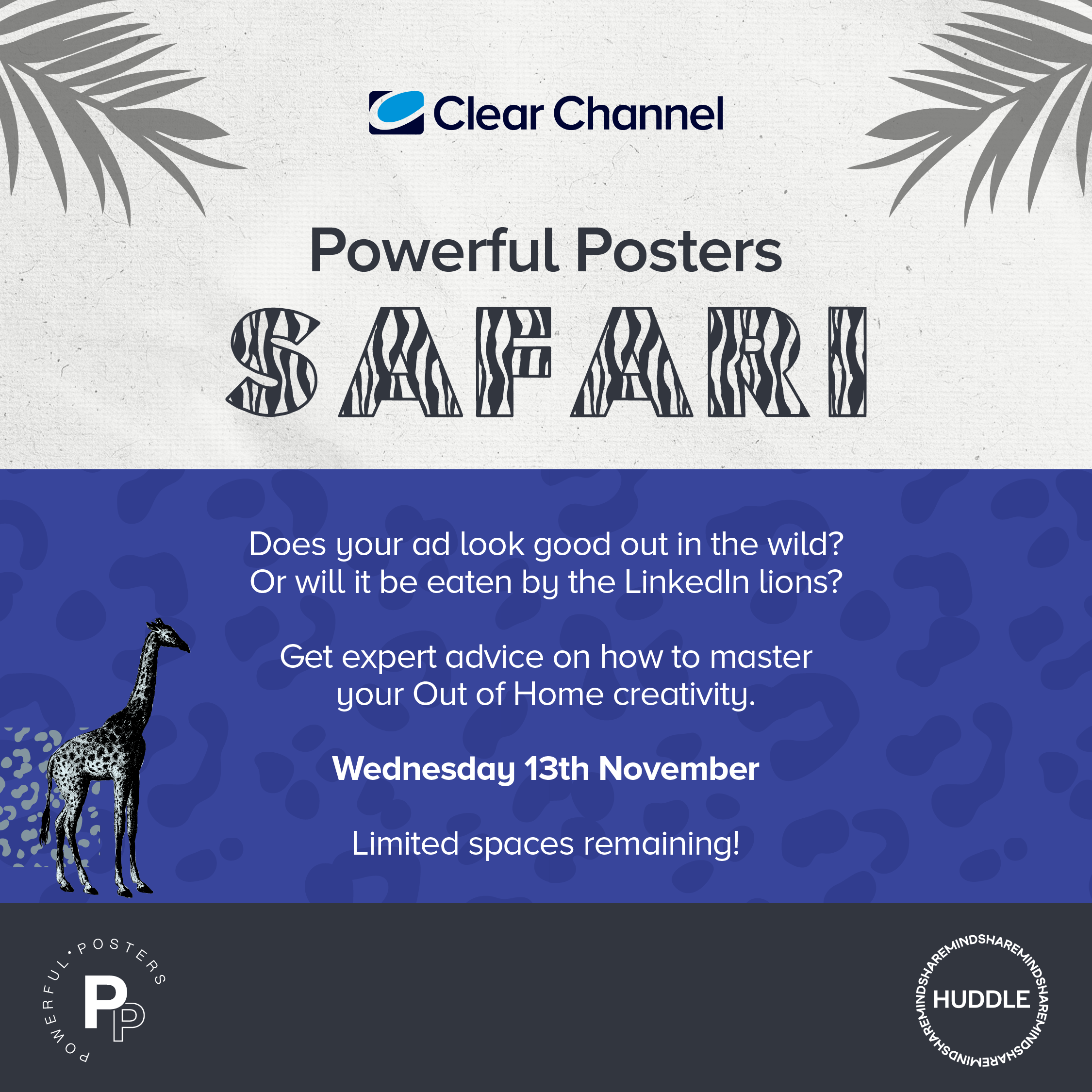
Powerful Posters Safari.
I had the opportunity to work on the branding for Clear Channel UK's Mindshare UK Huddle event, where I quickly developed creative materials for a unique OOH CopySafari experience. Led by creative guru Vikki Ross, the event aimed to give attendees a fresh perspective on crafting powerful posters. I collaborated closely with the team to bring the vision to life, offering a playful yet insightful tour into the creativity of Out Of Home advertising.
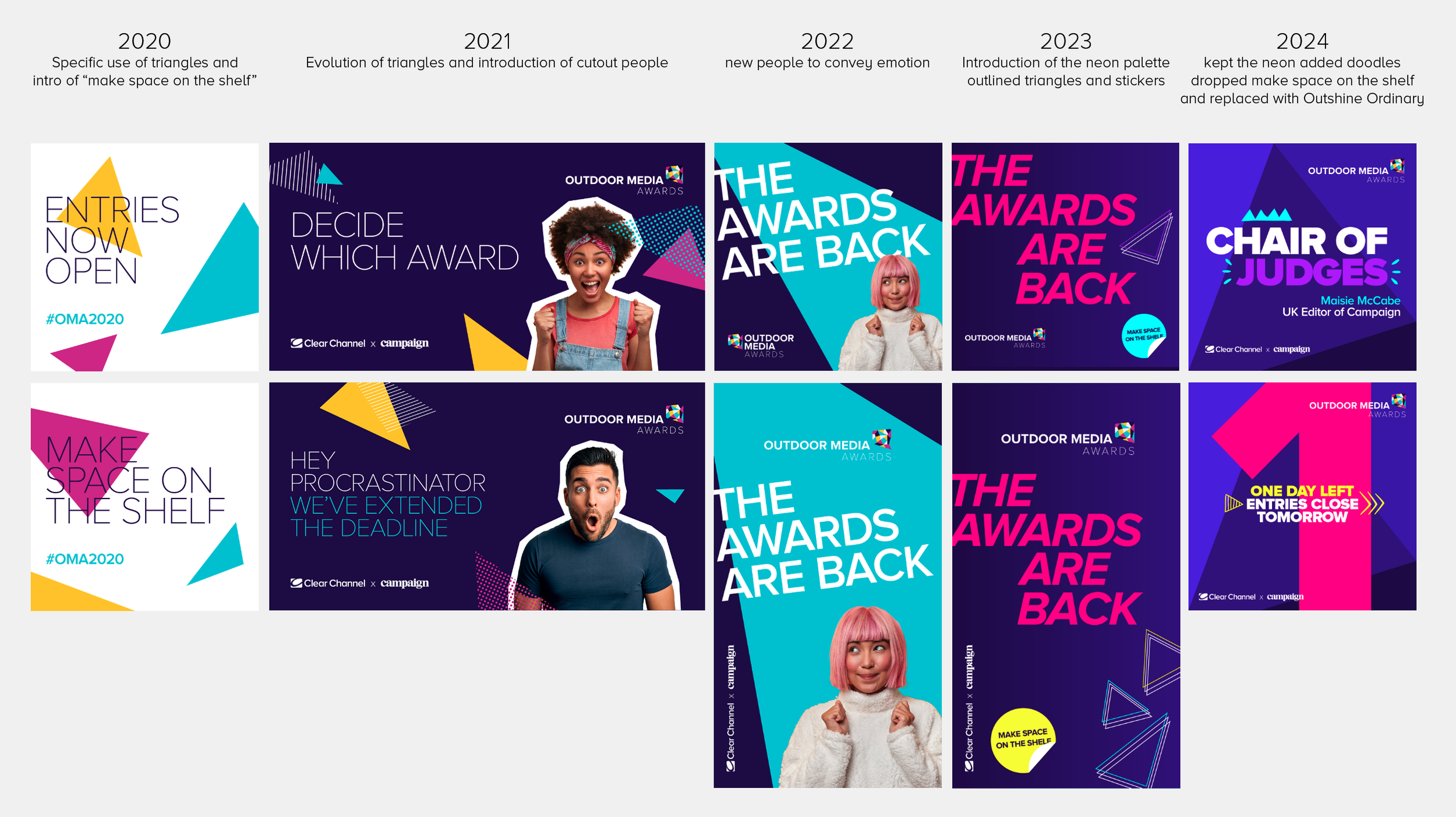
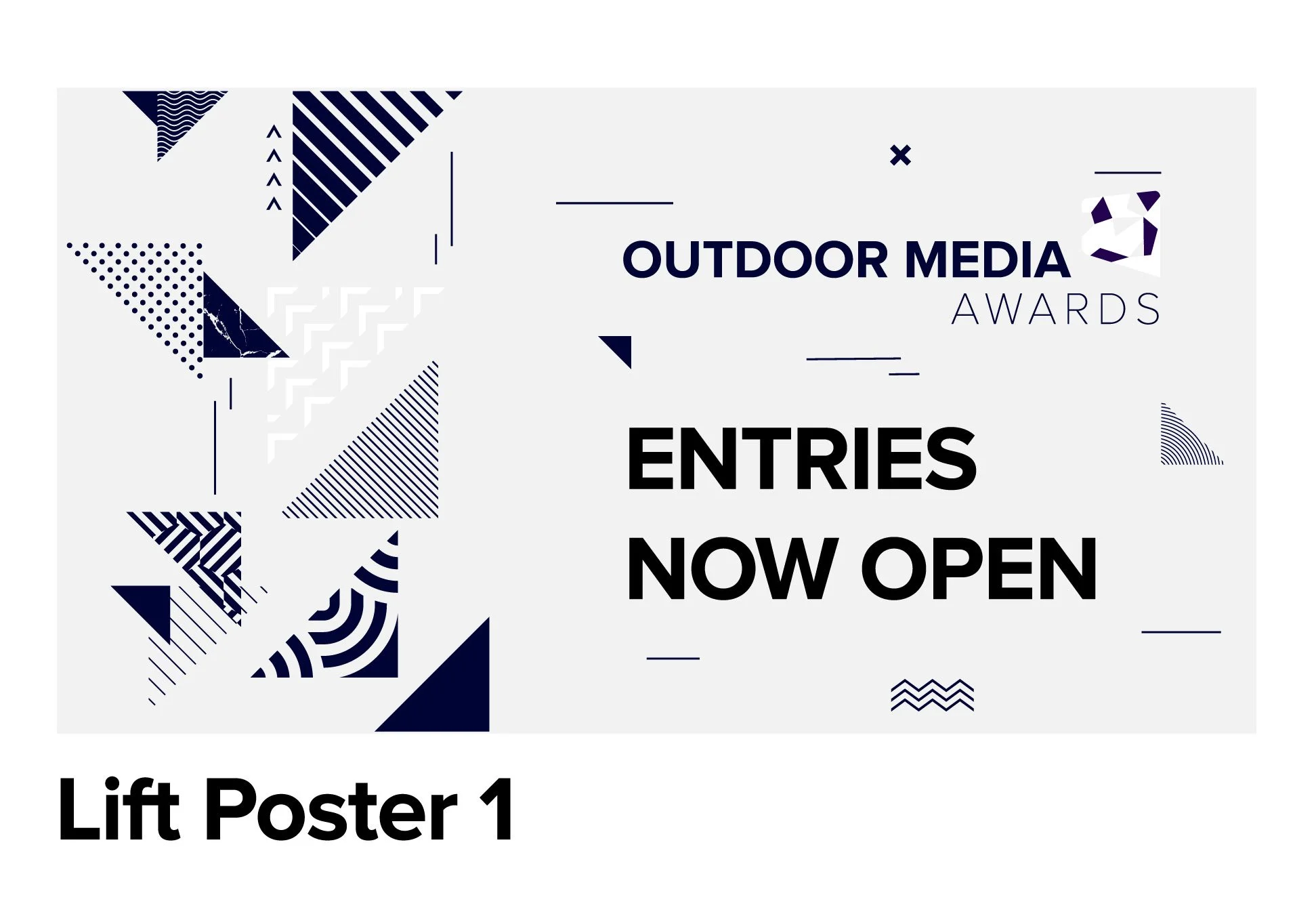
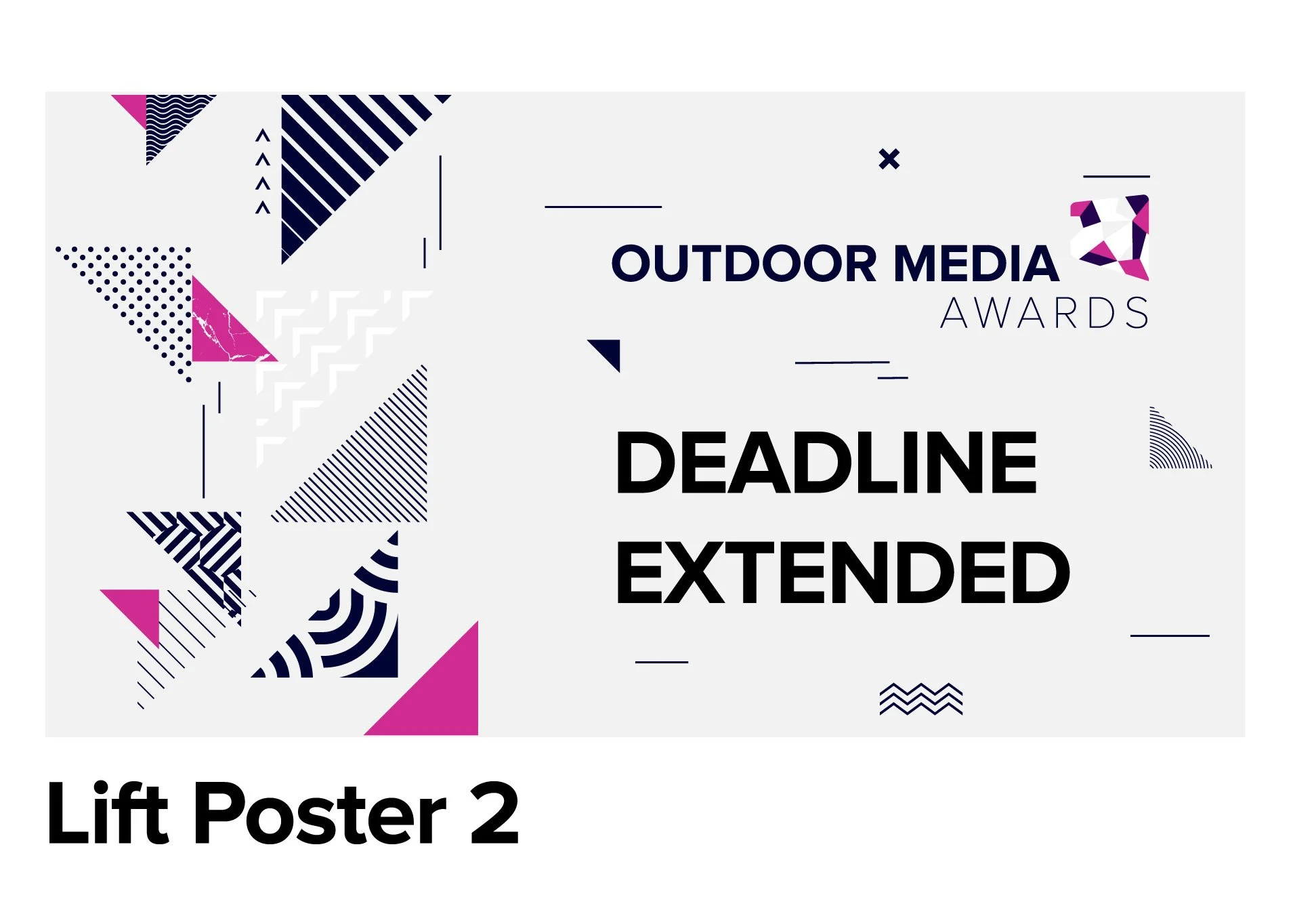
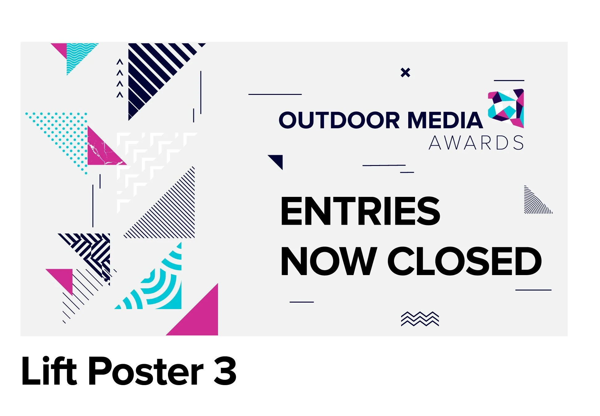
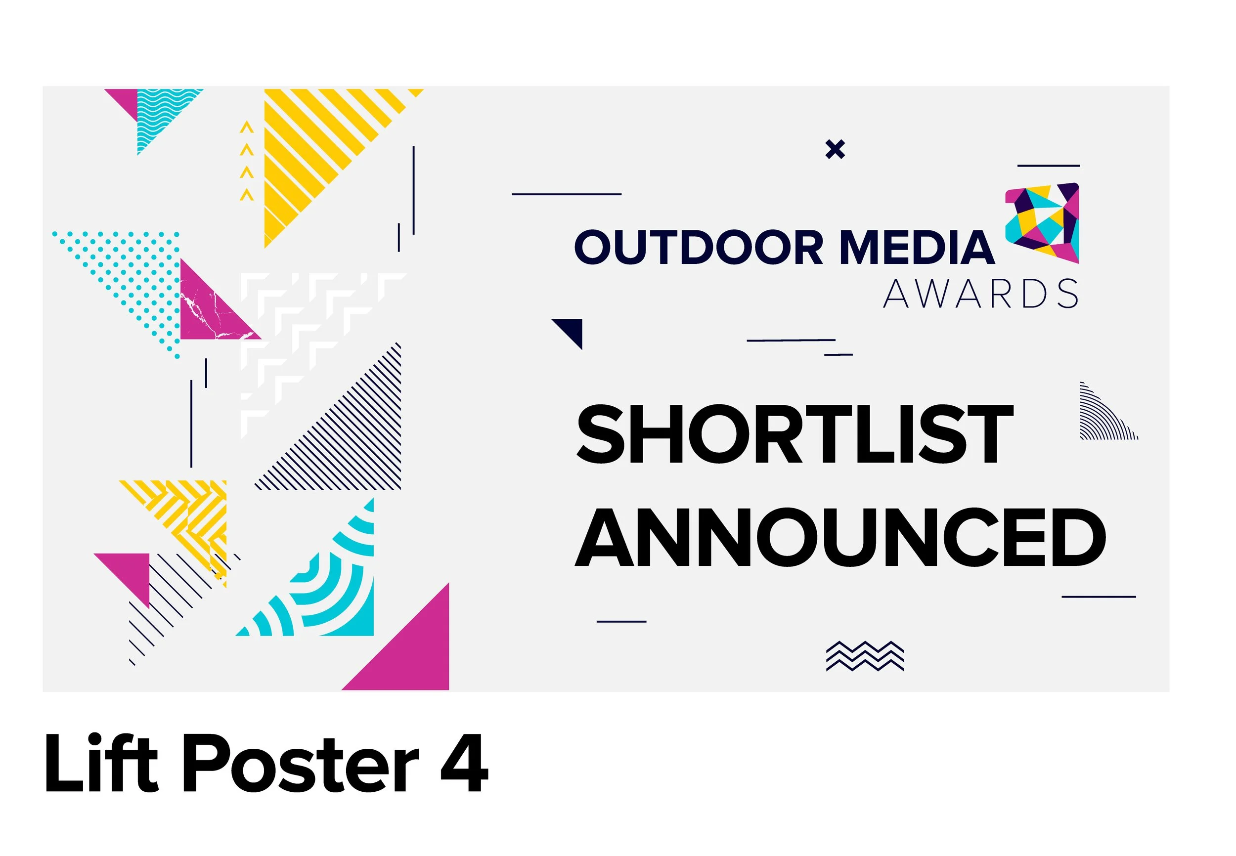
OMA’S.
Every year, Clear Channel hosts the Outdoor Media Awards to celebrate the best in outdoor advertising. This important event brings together top industry professionals to honor impactful campaigns. From eye-catching billboards to creative digital displays, the awards recognize those who challenge the norm. Join us for an inspiring evening filled with laughter and fun surprises as we toast to the innovators who brighten our streets and captivate the public.
Below is my concept for this year's awards.
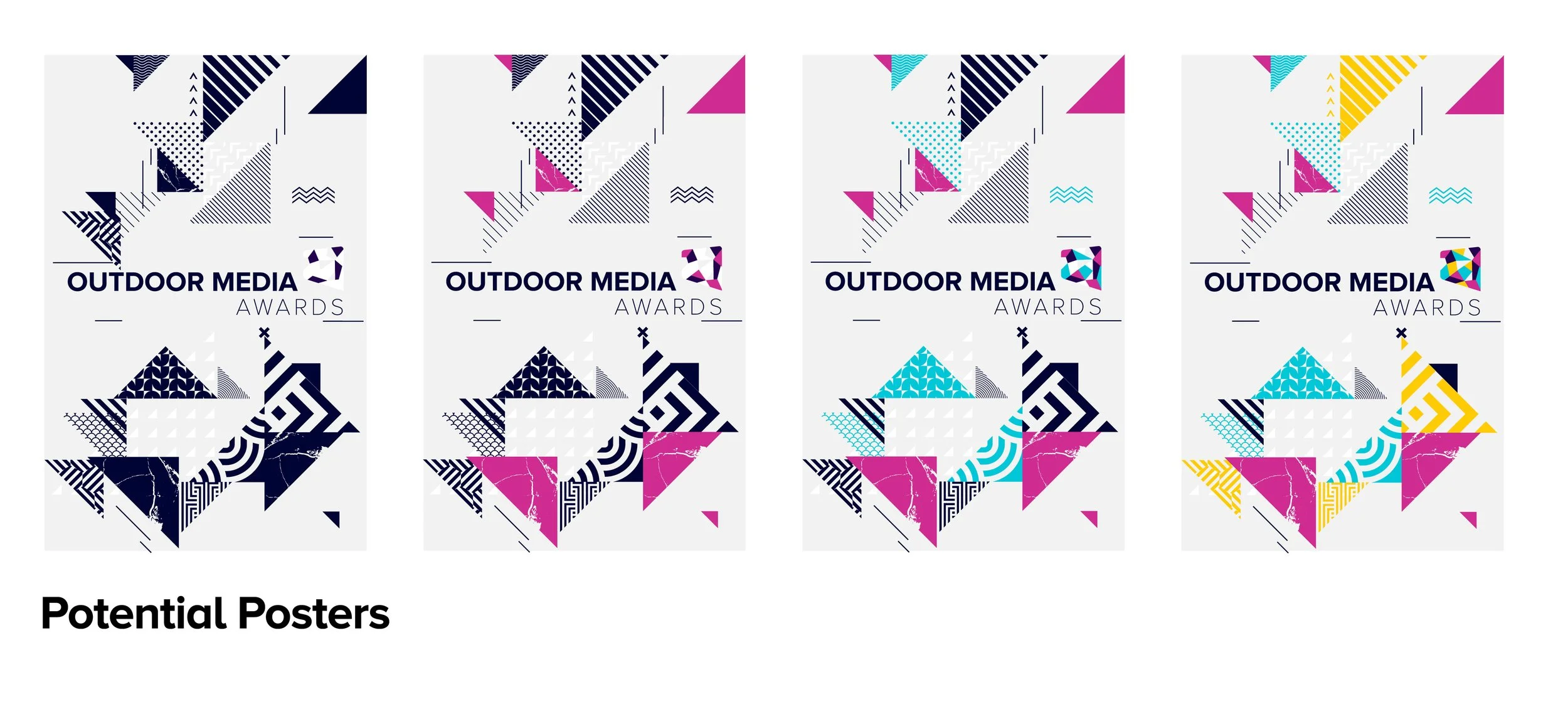
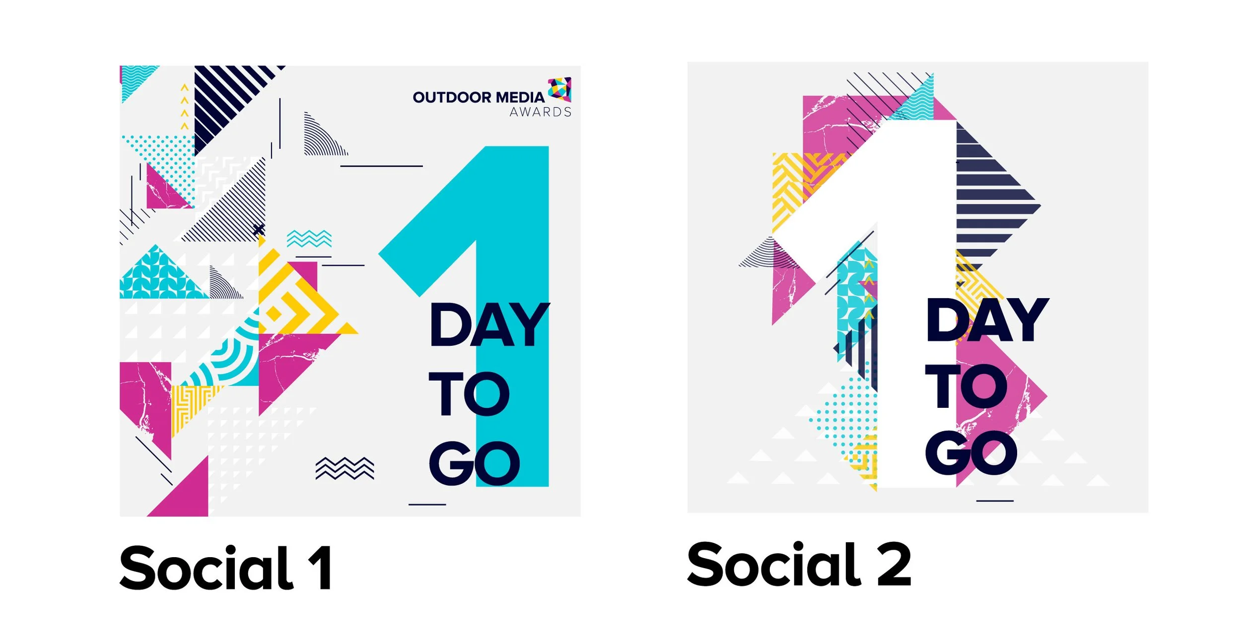
The Concept.
This year’s OMA Awards concept is centred around a vibrant, immersive journey, building on the iconic triangle shape that has been a signature element in previous years. I envisioned a refreshed interpretation of this motif, where the journey to the event is represented by a dynamic colour progression. Each key moment leading up to the awards will be marked by a new hue taken from the logo, with textured triangles weaving throughout the visual design, creating movement and depth. As guests enter the venue, they will be enveloped in a seamless transition of colours, guiding them through an engaging and sensory experience.
The colour journey culminates on stage, where the vibrant hues align with the energy and atmosphere of the event. This fusion of colour, texture, and movement aims to create a truly unforgettable celebration of creativity and innovation.
Moodboard.
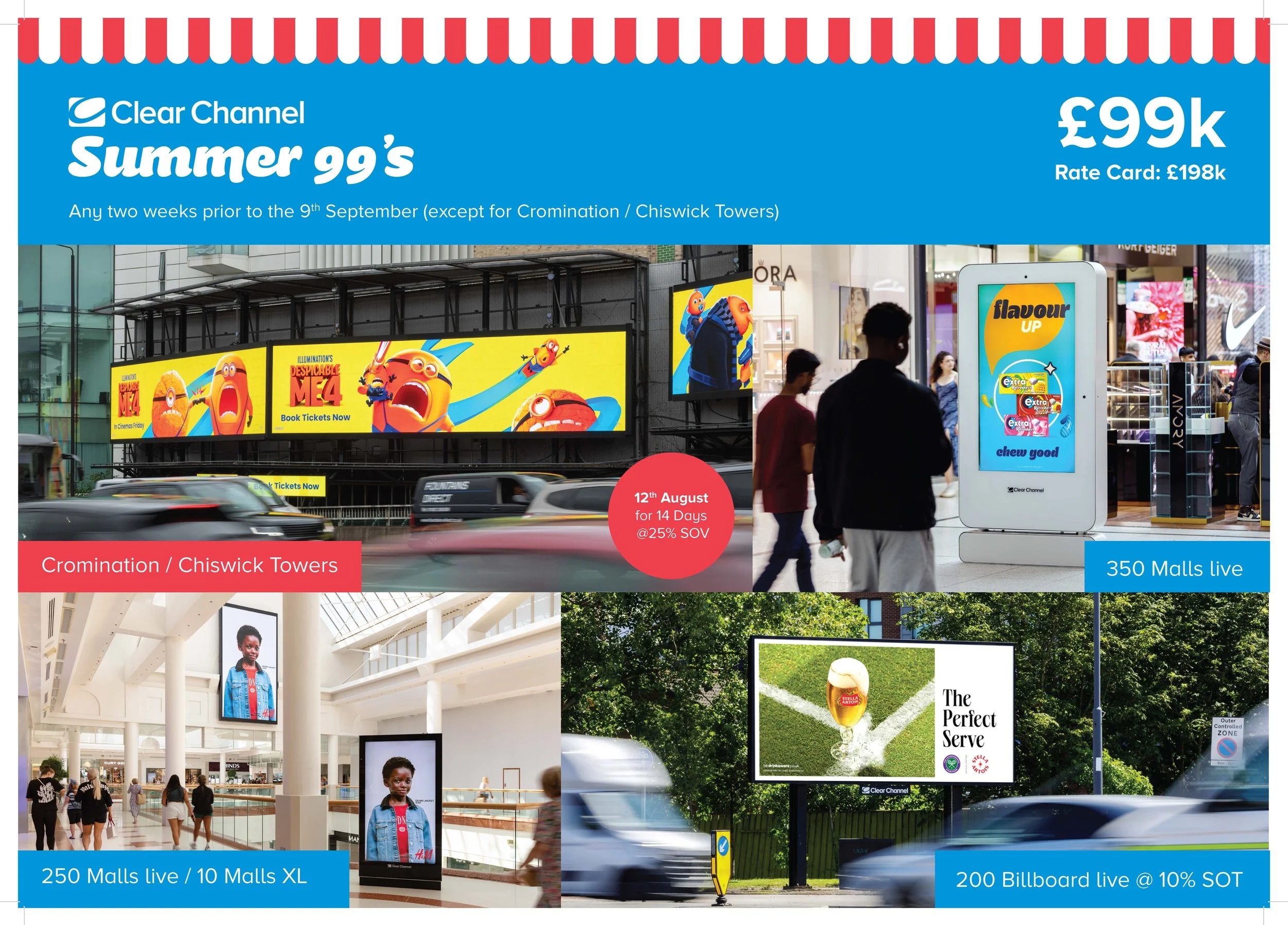
Extra assignments.
During my time at Clear Channel, I had the incredible opportunity to contribute to a diverse range of projects that allowed me to refine my skills in both design and marketing. Engaging in numerous high-impact campaigns, I played a key role in developing creative strategies and crafting visually compelling materials that resonated with a broad audience. This experience not only honed my ability to think outside the box but also taught me how to effectively collaborate with clients from various industries. The fast-paced and dynamic environment at Clear Channel fueled my passion for creativity, as I was constantly challenged to innovate and push boundaries. My time there has been an invaluable chapter in my career, providing me with the expertise and versatility to navigate the ever-changing landscape of design.

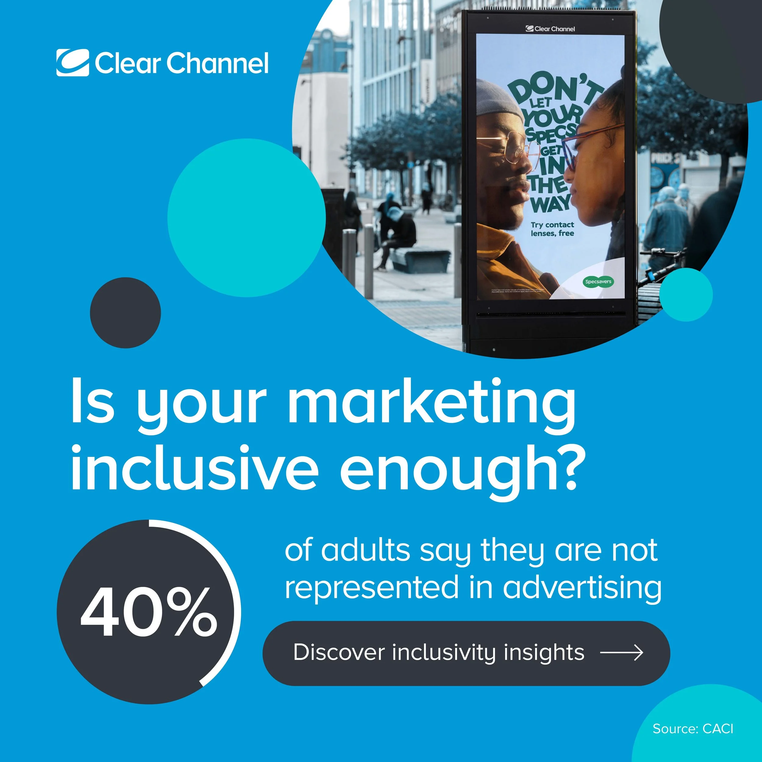
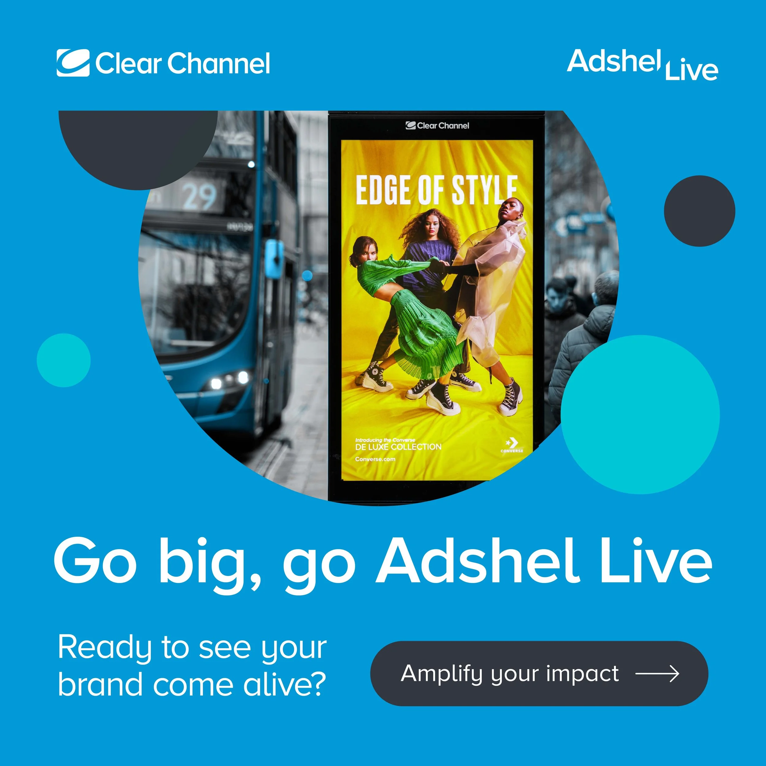
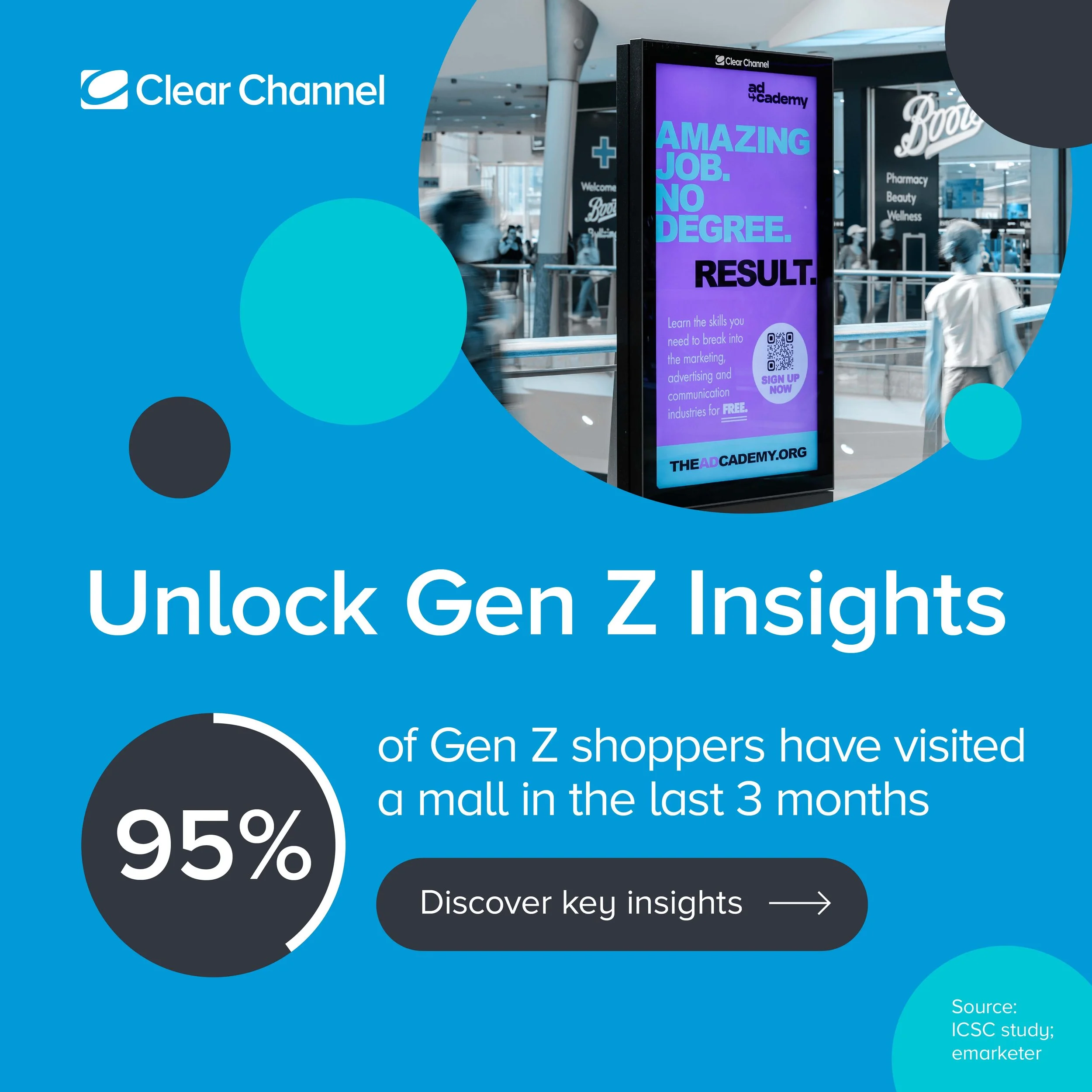
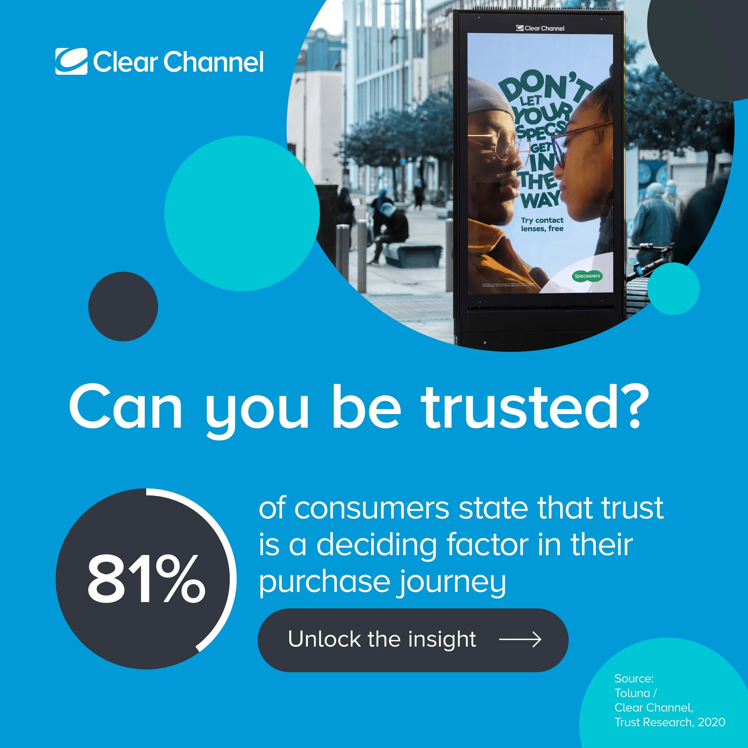
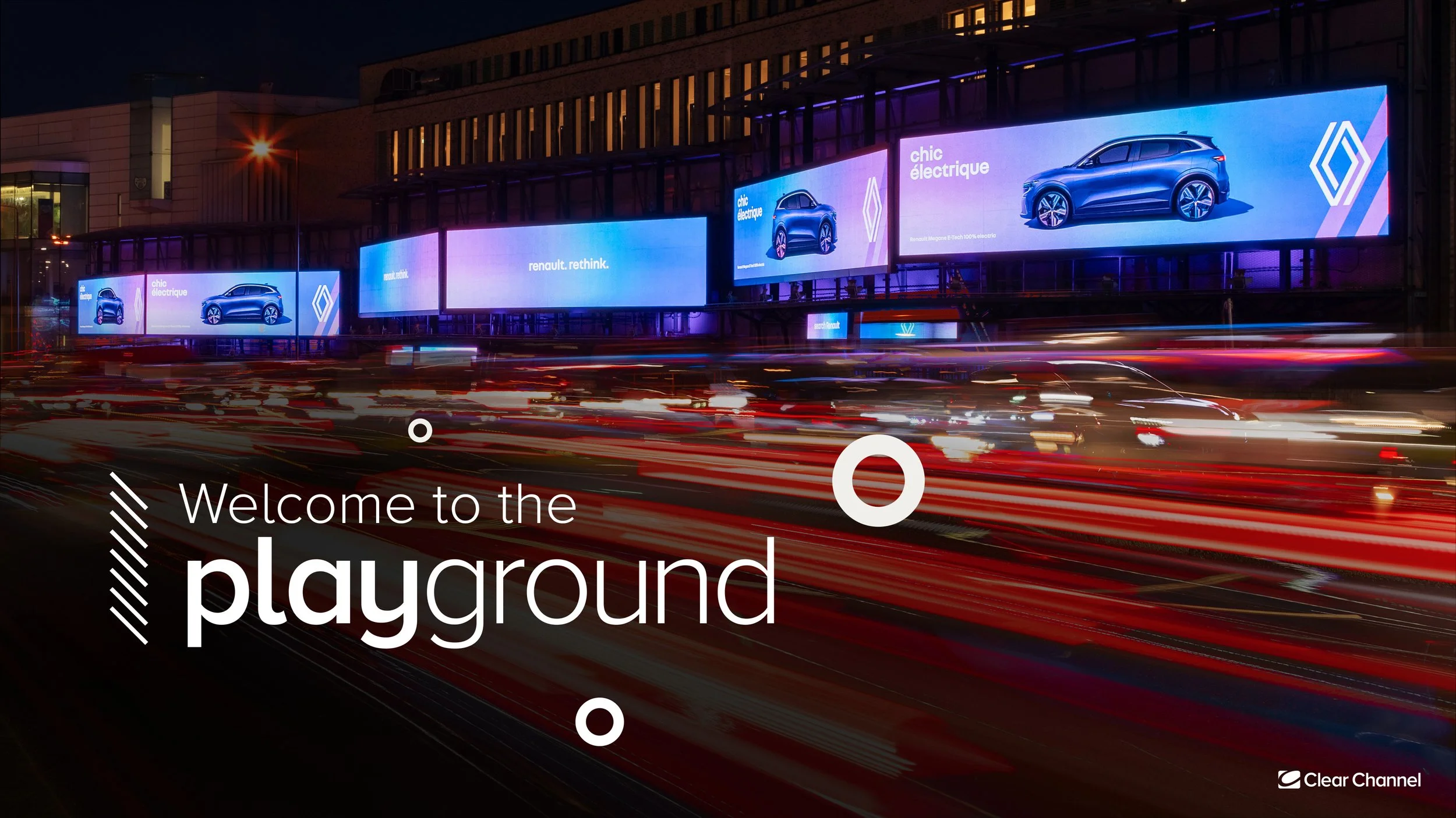


Ceros.
I created dynamic and engaging Ceros projects for Clear Channel, designed to elevate the user experience and bring interactive content to life. These projects focused on delivering rich, immersive visuals that enhanced Clear Channel's digital presence, providing an innovative way to showcase key data, trends, and insights. By blending creative design with interactive elements, I ensured each project was not only visually compelling but also intuitive, making it easier for users to explore and engage with the content in a meaningful way.